How to design a corporate/business layout?
29/06/2012
 Let’s open a new document with size 1680px, and 72 dpi resolution, also setting the two lateral margin guides to 360px.Inside the central section, set to 960px, we will insert all the site content which needs to be seen by a user regardless of the type of monitor (resolution) he or she is using.
As such, even if the site will be developed using a dimesion to 1680px (so that it looks great even on a 21′ widescreen monitor)- we will limit the main content to a dimension of 960px. So, even for low-resolution monitors, the site will visualize correctly, without having the need to scroll left and right on the browser page.

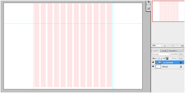
Let’s open the 960 grid system framework that you can download from this site. In this case we will be using a 12 columntemplate. If you want to learn how to use this framework, I advise you to read Nando’s article on the subject.
Insert the template in the file we are using and position it in the central section of the page, while leaving exactly 10px of margin on either side. It’s best to block the group (clicking on the key icon) so that columns are not moved by mistake.
Start creating a layout for this web page: with the rectangle tool draw a horizontal bar that is 148px high and 1680px wide. We will place this at the top of our document. Then let’s assign a linear shading which goes from a dark to a lighter shade of grey, as you can see in the following screenshot:
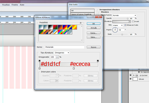
Let’s also add a shadowing of light intensity:

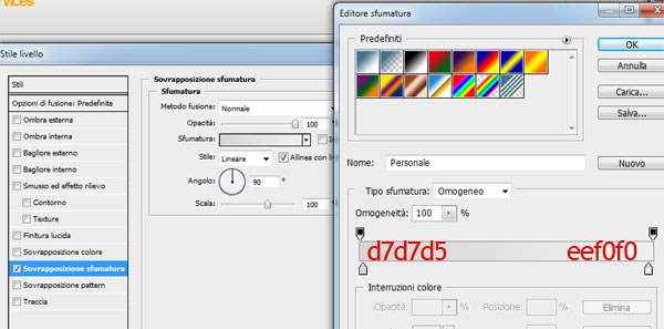
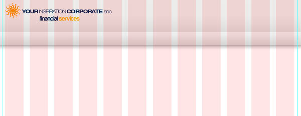
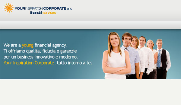
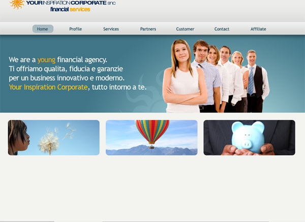
Insert the logo of our Company (Your Inspiration Web is momentarily transformed into a financial company, Your Inspiration Corporate) and draw, with the rectangle tool, another section (40px in height) that we will place under the logo and will serve as the background for the navigation menu.
Let’s assign a linear shading to this rectangle with the following settings:
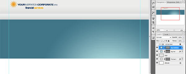
The result is as follows:
Let’s create the central section of our layout. Using the rectangle tool, let’s draw a section (286px in height) to which we will assign a blue shading with a radial effect so that glare can be created in the section where we will place an image representing the company.
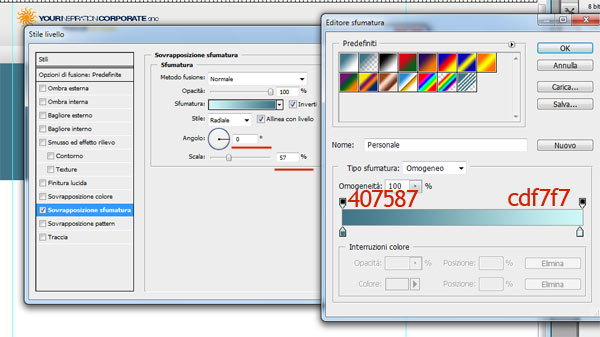
Blue is not chosen randomly: we have already mentioned that blue and green are the some of the best colors to use in a business-type layout because they can instill, on an unconscious level, a sense of security and corporate stability. Furthermore, since we are representing a financial services company it’s preferable to avoid using colors that are too hot or lively. Red should be one of the first colors to avoid, since it’s a color associated with danger and alarm.
The layout is starting to take shape:
In order to properly represent this company, we will insert a series of images of people that have a professional and positive aspect to them. This will instill a sense of familiarity and security to the various visitors of the site.
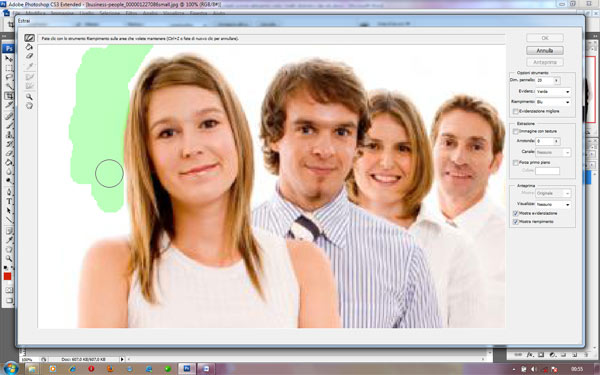
Choose a free image from sxc.hu , unfortunately this image has a white background. In order to add it to our blue header, we will have to eliminate the background of the image. To do this we could use the magic wand tool but the results obtained using this method are not ideal. The pen tool provides more precision but it is certainly more painstaking, due to its manual quality.
In this case it’s preferable to use the “Extract” filter (menu Filters >> Extract) which will allow you to edit the image with less effort.
How to use the “Extract” filter
Using this filter is not difficult and you can start getting some good results after a couple of tries. To begin with, it’s best toincrease the zoom so that you will be able to select an area with greater precision. To do this, all you have to do is click on the magnifying glass icon on the left-hand bar, then press CTRL and then click with the mouse. Let’s make the brush smaller (by default it is set to size 20, which is too big for detailed images) and start highlighting as accurately as possible the borders of our “promoter”.
If you’re not satisfied with the curve or you’ve made some mistakes, you can always go back (CTRL +Z) or use the eraser toolto delete the borders. Once you have highlighted the entire area, click the bucket tool to fill-in the selected image. You should end up with something that looks like this:
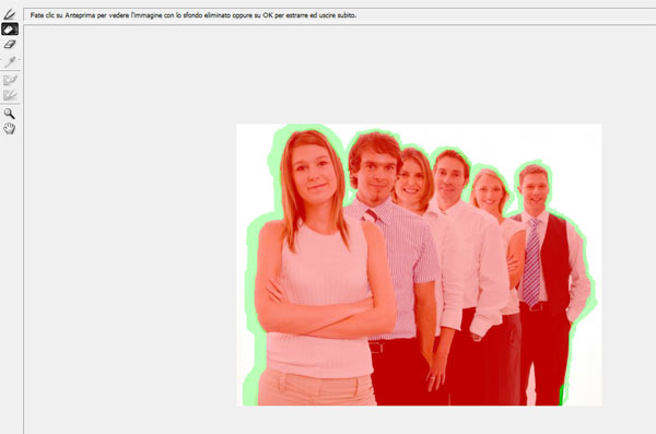
Clicking on ‘okay’, everything that is outside of the red area will be automatically deleted and we will have the image resting on a transparent background.
What’s the final result?
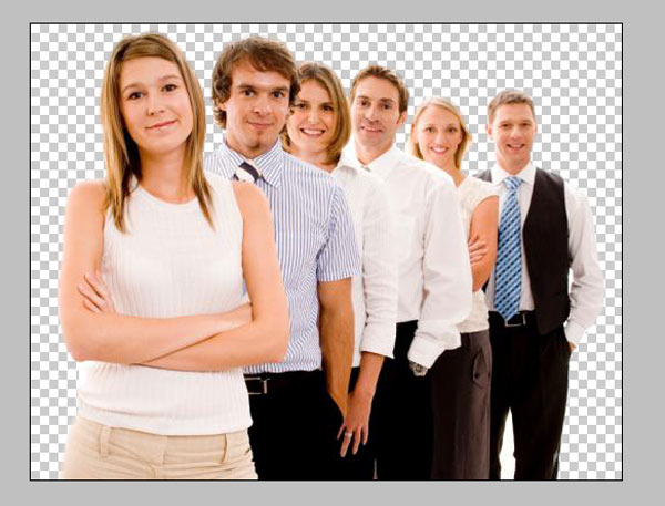
Let’s insert this image in the blue section, after having adjusted its dimensions and after having eliminated a small part of it.

Next to our promoters we will insert a brief description which will provide instant visual information to our site visitors. This can be either a short slogan, a welcome message or anything else that can properly welcome visitors and inform them about who we are.
Let’s add our website’s navigation menu, which will have to be simple and intuitive, and without too many adornments:
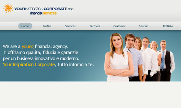
To evoke the company’s brand, we will add a transparent section of the logo near the slogan. This is so that our brand is pointed out and the graphics of this central section are enhanced.
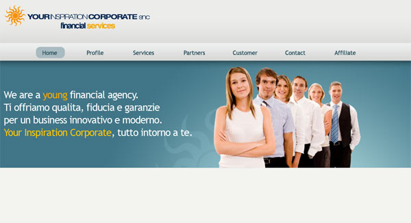
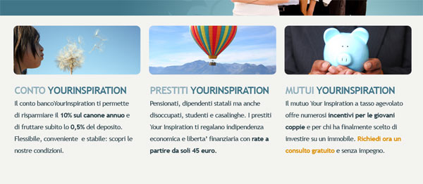
The layout is taking shape and it’s looking great, don’t you think? At this point, we will have to create 3 sections on each of the services we offer: accounts, loans and mortgages.
Using the grid, let’s divide the layout into three sections of equal size (300px). Then we can go ahead and personalize each section inserting three representative images:
Under the images, we will add a description of the services offered. In this step, font typography will play a very important role so use bold font to highlight important concepts and keywords in the description. Also, you should divide links by colorso that the text can be read with less difficulty.
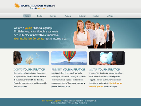
The addition of a simple footer will complete the layout of Your Inspiration Corporate. Let’s look at it together now!
Conclusion
After having looked at what makes a good “corporate style” website, we have been able to create a simple and professional layout for a corporate website using just a few steps. The resulting website has a nice look to it and at the same time it is quite functional.