Essential E-Commerce Website Features: Tips and Examples
03/08/2011
We will look at these common features that you will find in almost all e-commerce websites.
Product Navigation
Perhaps the most important component of an online store is its navigation system.
Good website navigation is essential for any site, but much more so for e-commerce sites. Users need to have the ability to browse among different categories and products quickly through an intuitive navigation system. Investing in the information architecture of an e-commerce website is paramount in the site’s success.
Amazon has had one the best-designed (and also extensive) navigation systems out there. The categories of the products that can be found on the site are well organized and give users the ability to swiftly navigate between different product categories.
As you’ll see in the preceding examples, a left vertical navigation menu is popular because it allows us to include more links versus a horizontal navigation menu.

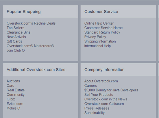
Overstock represents its comprehensive primary product navigation system as a vertical menu bar. In addition to the site’s primary navigation menu, Overstock has a robust navigation menu in the site’s footer.

This e-commerce site sells eco-friendly products. It has a vertical navigation menu on the left. They chose to style the "Sale" link so that it’s bold and in red in order to make it more prominent.

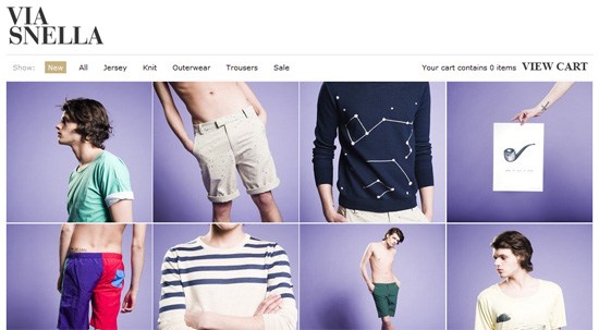
When an e-store has a small amount of products or product categories, a horizontal menu bar can be all that’s needed for product navigation. In the example below, you can see that Via Snella, a male fashion company that’s only been in business since 2006, can get away with a simple filter navigation arranged horizontally.
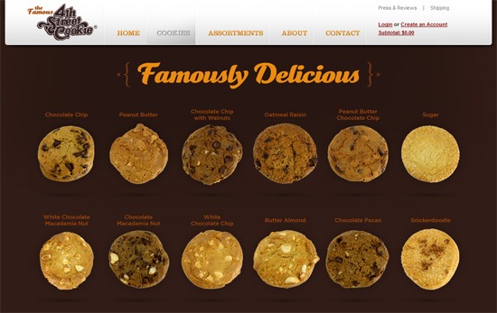
The 4th Street Cookie Company is primarily a physical, brick-and-mortar store. However, they complement their physical store sales through their online shop. The product navigation in this case doesn’t need to be as extensive as a store like Amazon.com, since the cookie company only has a handful of unique products to offer. They’ve resorted to a thumbnail navigation for navigation to product pages.
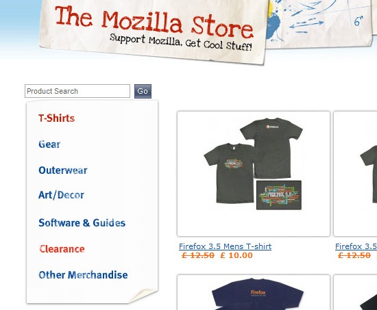
The Mozilla store uses a left vertical navigation menu, displaying the product categories they have in the site.
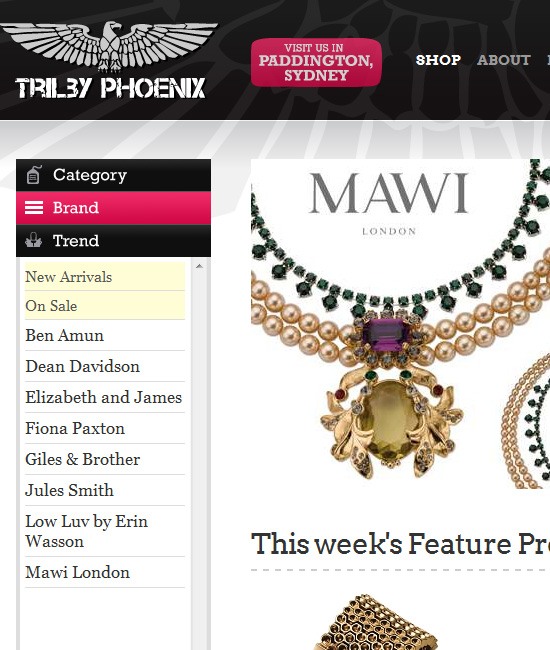
This e-store provides shoppers two ways to browse products: a vertical navigation menu and a drop-down menu that appears when you hover over the "Shop" menu item in the site’s horizontal menu bar.

In this e-store, you can browse products using the left vertical navigation menu. The menu is subdivided into three main categories. Clicking on one of the main categories displays more links.
Empire Patio Covers uses a horizontal navigation menu. To get around the lack of space that’s associated with fixed horizontal navigation menus, submenu items areprogressively disclosed using drop-down menus.

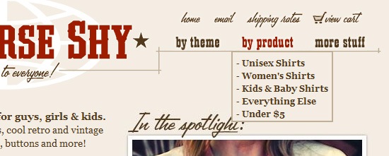
The product navigation system on this e-store is simple. You can browse by theme or by product.
Search Box
Having a clear and well-positioned search box is crucial to an e-commerce site. The ability to search an e-commerce website is very important because many online buyers have a specific item that they are looking for. A search box is a powerful site feature that will improve findability and navigability.
Often, search boxes in e-commerce stores are in very prominent positions, high up in the layout, enticing the user to search the site for the product they want.
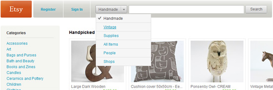
The search box of Etsy is a jutting fixture of the site’s design. It also allows you to limit your search within specific categories.
This e-commerce site has a search box that’s highly visible and placed in a high-value location. It has placeholder text to give users ideas on what they could search.
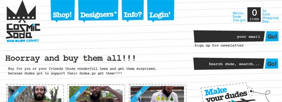
The search box in Cosmicsoda is located on the right sidebar. Its unusual shape and eye-catching design can draw the attention of site users.
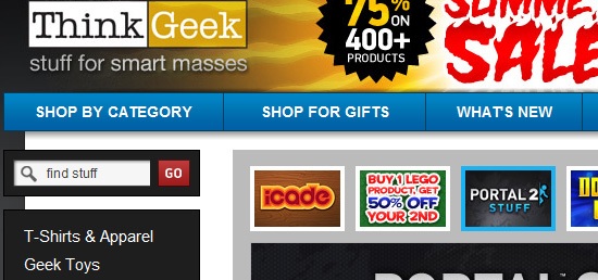
ThinkGeek places its search box on top of the vertical product navigation menu to make it easy to find. In addition, grouping the search box and product navigation menu makes sense because they are two site features that can be used together.
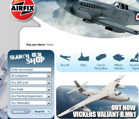
Airfix has a search box widget that has options for advanced search criteria filtering. This example demonstrates a good way to provide a persistent advanced search feature that’s compact.
Shopping Cart
A shopping cart is almost always present in e-commerce stores. The shopping cart is usually the first screen in a checkout process. Products in the user’s shopping cart are typically displayed in a table/matrix format.
Its purpose is to display the items that the user has decided to purchase. It’s a highly functional feature that gives you a summary of the things you’re buying.
Common elements of shopping cart pages are:
- Product name
- Short product description (if the product name needs further explanation)
- Product’s price
- Total cost of products in the shopping cart
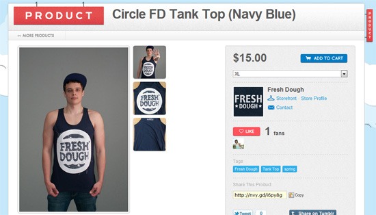
- Product image thumbnail that displays a preview of the item
- Quantity box that allows users to modify the number of items they want to purchase
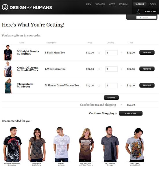
The shopping cart of DesignByHumans is clear and functional.
This example displays most of the common features we repeatedly see in shopping cart pages: quantity box, cost summary, the ability to remove a product or modify the quantity you want to purchase, etc.
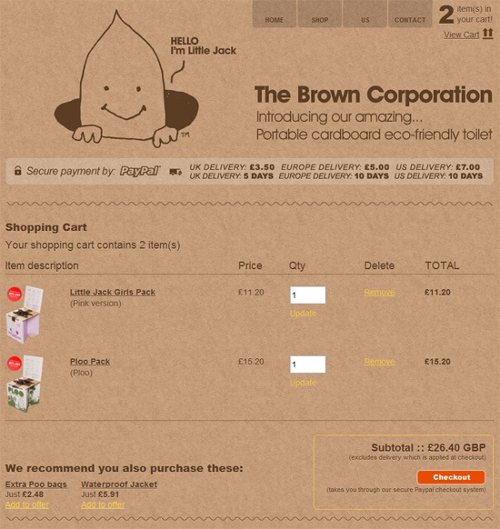
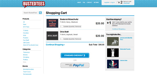
The shopping cart of BustedTees gives you suggestions of other things you may wish to purchase based on the items currently in your shopping cart.
When you hover over the shopping cart icon on this e-commerce website, instead of being directed to a shopping cart page, it will show you a short summary of items in your cart. This is a convenient way for shoppers to quickly see what they have placed in their cart without having to wait for another web page to load.
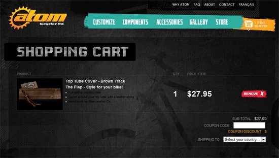
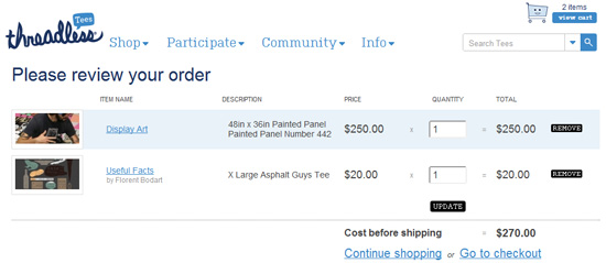
The Threadless shopping cart is clean and straightforward.
Featured Products
Often, e-commerce stores have certain products they want to highlight. These products are often found on the front page of the site. These products are usually items that are on sale/clearance or new items that have recently been added to the inventory.
There are many ways to put featured products on center stage. A popular method is to have an image slideshow at the top of the home page’s layout.
The image slideshow on this e-commerce website takes center stage. At set intervals, it changes slides to display featured products and news.
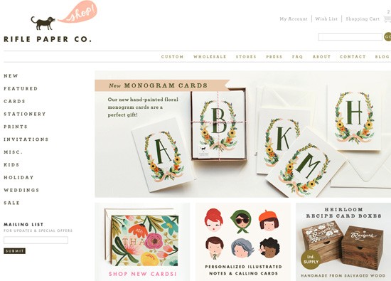
Featured products on the Rifle Paper Co. website are displayed in an image slideshow, as well as in a 3-column thumbnail arrangement below the main slideshow.
A big featured area can be seen in this e-commerce website. It takes up a significant amount of home page real estate.
Featured items in this e-commerce website are displayed as the site’s background. As you navigate through the items using the left and right arrows on the left, the background image changes.
Product View Filtering and Sorting
When displaying a category of products or a list of search query results, having the ability to filter or sort products can greatly enhance the ability of the user to find exactly what she’s looking for.
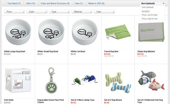
Crate&Barrel allows you to filter products by price, type and more. The e-store also allows you to sort products alphabetically or by price.
The Ten Little Monkeys e-commerce site, which sells designer clothing for kids, gives shoppers the option to sort products chronologically or by price.

Bridge55 has a vertical checklist of product attributes to help you filter products so that you can find ones that match your criteria.

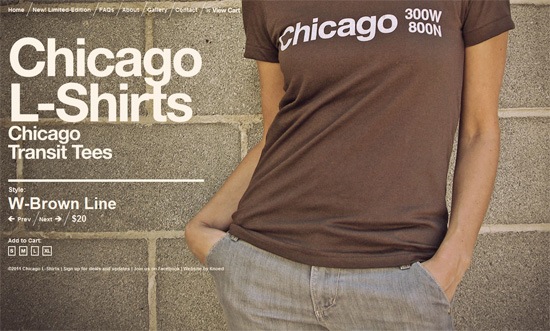
Product Images
The main disadvantage of e-commerce websites when compared to traditional physical retail stores is that websites can’t give shoppers the ability to touch and see products.
Thus, images of the products being sold must be included and displayed in an enticing way. Images must be big enough to see details and features of a product.
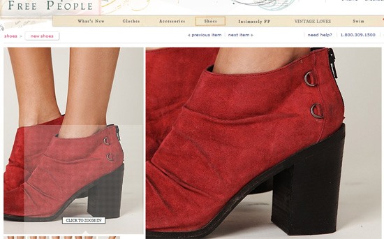
This clothing e-store has high-resolution images. Browsing through product photos gives shoppers an interesting user interface that allows them to drag their mouse over areas of the photo to see the area in greater detail/resolution.
Many e-stores place thumbnails of other product images below the current image. However, in this example, they are arranged vertically on the right side of the current product image being viewed, making them highly visible to users.
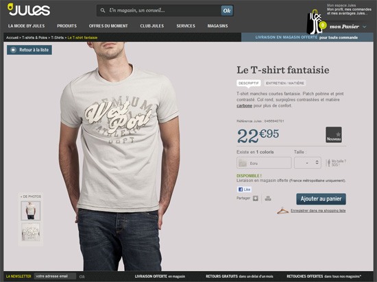
The product images on this site are beautiful and large. They integrate well with the other contents of the product page.
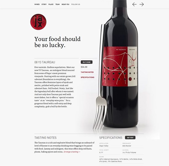
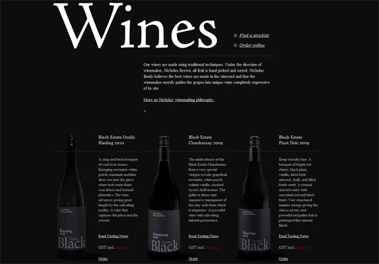
Photos of the wines being sold in this e-store are masterfully arranged to complement the site’s design.
Large product images secondarily serve towards the aesthetic appeal of this e-store’s web design.