How to project a minimalist layout? attention to the details
14/05/2011
According to Webdesignerledger it is one of the web design trends of 2010, according to others it is a style destined to remain timeless and a sign of good taste and refinement.
The password is “Less is more”, that is: Less is better. White, black, at the maximum a single color. Graphics practically inexistent, images reduced to the essential minimum. The minimal layouts, shadowed by the vintage/grunge/doodles styles of the turn, live now their principal moment of splendour and make a good display of themselves in the galleries and in showcases of the biggest thematical blogs of the sector.
But which are the details that make a minimalist website successful?
White background, a navigation menu and three paragraphs: there is someone who really believes that behind a minimalist website it’s not the same graphic projection required by the most “graphic” sites or the same dosage of aesthetical sense.
Nothing could be more wrong, on the contrary: a minimal layout requires a decisively more minute accuracy of details, just because the absence of graphics and the use of few colors impedes the camouflaging of eventual flaws and highlights even further the problems related with typography and with the white spaces. In this article we will see, in synthesis, which are the details that deserve attention in the completion of a minimalist layout professional and captivating.
1. A good logo
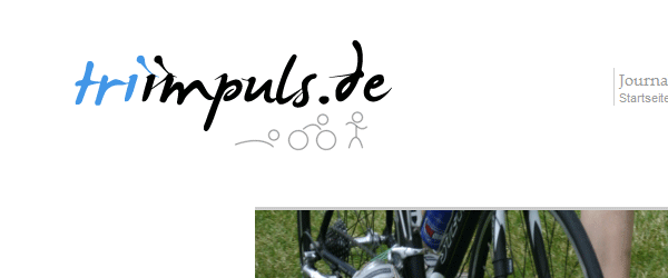
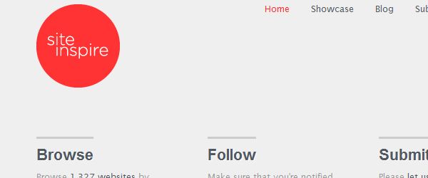
If in a site rich in graphics it is possible to hide somehow the turn’s amateur logo, in a minimal layout the logo shows off and if it is the only color note of the template, it represents the first element on which the user will lay his eyes upon. It is not by chance a lot of minimal site styles owe their aesthetic efficient impact to the logo, which even quite simple in black and white, it represents the only dynamic and vivid not of the entire layout.
2. A full-bodied and original font
In a website which reduces to the minimum the graphics is practically obvious that the typography covers a primary role of the layout’s aesthetics. An original note is inserting text content – a slogan, a welcome message, or even the website’s name – using a more versatile font, like for example a calligraphic. In this way there is a tendency to “play down” the website a little, which otherwise risks to appear too “snobbish”, austere.
3. Choose a color
This is not a rule, but however it’s the cult of the moment. Normally, the layout is made in grey scale with a color in contrast to revive the whole. Every tonality should be alright, but the best are the red, the orange, bright and vibrant colors in general, used in general for the details such as buttons or links.
4. Typography, queen of the layouts
Key concept already overtreated but I repeat it: a good typography can make a website successful. Even more if the website is almost totally concentrated on text content with respect to the graphic component.
The passwords? Legibility, Harmony and Aesthetics. Therefore keep an eye on the interline, the tittles (which the bigger they are, the better it is) and not to use a lot of fonts, even of different families. Remember that the layout has to remain simple and ordered and useless habits and frills do not belong to this style.
In general, the typographic tendencies of this style can be summarized like this:
- Titles and links in bold, in capital, in block letters. The more they are highlighted, the better it is.
- Also for the titles, the contrast between grey (or black) and a bright color.
- Background to the text, be it colored or negative effect (black highlight with white text)
5. Icons, adhesives, balloons
If you feel like cementing yourself in a minimal layout but you feel sorry having to completely give up to the graphics, you can always enrich the layout with small graphic details such as icons, badges and so on. The general rule is: do not overdo it. For the rest give it a try and let yourself be guided by the good taste.
Some already tested elements and surely aesthetic success?
- Colored badges, preferably from spherical forms.
- Balloons, of every form and color, as logo complements or for attracting the attention on certain details.
- Icons: to be prefered in grey scale and with rollhover effect.
Inspiration
If you like this style and you want to see some layouts of success, I advise you to have a look to the following showcases: there are some absolutely fascinating.
- Vandelay Design: Minimalistic webdesign
- Webdesigner Wall: 50 minimal site
- Pro Blog Design: 30 beautiful and clean blog design
- Spyre Studios: 40 killer minimalist blog design
Conclusions
The minimal style layouts are the tendency of the moment. Even it might appear as if they don’t require a big graphic competency, it is obvious that for a layout of success-of whichever style it is- it is essential the study of details as well as an appropriate projection of the content. On the other hand even a minimalist layout –that superficially might appear easier to be made- can become a bare website and lacking efficiency both from the conceptual point of view and from an aesthetic one.


