Why do people run away from your site?
13/05/2011
You have noticed: in the era of web 2.0 and of the social sharing, information is accessible from multiple sources (although there’re often less authoritative respect to the last period).
So, often a user can find himself on your site after a googling, without a particular reason that drives him toward it. At this harsh realty you have to add the statistic data (J. Nielson – Web Usability 2.0) for which averagely a user spends about 30 seconds on a site, after he generally leaves it returning to the page results.
Summarizing, you have 30 seconds to convince your user that your site is exactly what he’s looking for, or at least he’s on the good way.
So, how can you make your user stay longer on your site giving you more time to convince him to purchase your services, products or follow your blog?
User Experience does the difference.
Understanding the problem is already ¾ of the solution, but if you follow the accessibility and usability guidelines and the web standard, you’ll be really on it.
We already realized that basically we don’t have time, so losing more time isn’t an intelligent choice.
How can we capture the user’s/reader’s/potential client’s attention in 30 seconds?
Eliminating time wasting. I refer to introduction pages, that can be more or less in flash: if they don’t convey information you’re stealing time to the user, in fact if he wanted to see that fabulous 3d effect, he would go to the cinema. If you have transition effects between the pages or to visualize the contents, ensure that 1. it’s clear how to activate them and 2. the relationship between aesthetics and speed is fairly balanced, we lean towards speed and reminding you that most people don’t have a well equipped car like yours, that do a certain type of job with computer.
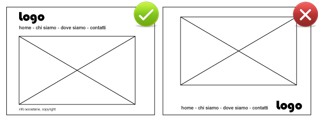
These are the most evident ones, but also a menu or a logo out of place are a waste of time: think about it, we’re so used to canons and you can also be creative even with the logo on the upper left and the menu at the top or in a sidebar.
If you think that this puts a limit to your creativity, well probably you’ll be better off painting! Seriously, there are rules everywhere: chairs have generally four legs, but above all a seat and a backrest, tables have a table top and legs…but you can find them in different manufactures, materials, colours and forms, some of them with a very nice design.
Back to your site, you have to keep in mind that when a user links to your site he wants to find immediately what he’s looking for, he isn’t in the mood to understand strange mechanisms for which he needs to play target shooting in order to point a menu item, so stay on the traditional.

This advice is valid also for the titles you use: it’s always preferable to use the traditional “Home, Who we are, Where we are, Contacts, than fantastic names.
You know those pizzerias that name their pizzas “Alfredo”, “Marco”, “Giulio”? They’re certainly original but also incomprehensible. If we’re talking about a “plain pizza”, a “pizza with hot salami” and a “pizza with hot dog”, wouldn’t it be better to write clearly these words instead of forcing people to read the list of ingredients of each pizza?
We’re back to the point: a waste of time that in this case means the duty to click on “Ambrogio” to find out that it’s the “Services” page.
Instead if you use the traditional menu items users will know 1. where to find what they’re looking for without getting lost and 2. what to expect opening a page without finding themselves confused.
Under the shell
But it’s not only a matter of time wasting. Have you checked that everything works, on all the browsers and devices?
If you use flash you need to have alternative contents, obviously for hypo-sighted/blind people but also for other reasons: it’s useless to go into the merits of the Adobe vs. Apple war, but besides iPhone we have to consider that the web browsing in mobility is increasing, so we’re talking about devices that use a generally slow connection for which flash isn’t the ideal technology. Similarly you have ensure that everything works also with disabled javascript, that the effects you use to decorate graphically your site don’t turn out to be an obstacle.
Instead if you use the standards recommended by WC3 and you have a valid (x)HTML code, well, it’s very likely that your site works wherever without too many adjustments (just a couple of hacks for IE6).
Why is it so important that your site works correctly in all cases?
First: because it could be the user to which you didn’t think about that can make you rich. Do you think I’m exaggerating? Probably I am, but probably I’m not.. I quote the example given by J: Nielson in his Web-Usability 2.0, of which was protagonist a famous brand of television: the main products were big televisions and their site integrated an e-commerce . All not optimized, so impossible to navigate for the hypo-sighted and blinds. The company replied to the objection saying something like: “we sell televisions and the blind don’t fall within our target” unaware that the hypo sighted could benefit from a larger screen and that anyone, even a blind person, may want to buy a TV to make a present.
Second: because for the users, if a thing doesn’t work, it doesn’t work and that’s it: it doesn’t exist trying with another browser , up-dating it, activating javascript. If the site doesn’t work the first time a user visits it, then he will not try again. He’ll go away frustrated and probably you won’t see him again: a user lost.
This is a base for reflection from which to start trying not to scare away users from your site, but considering that we -you and I – are also users, I want to ask you a question: think about it a second, why do you run away from a site?