Gold section and web design: how to use it and why
29/09/2011
What do we mean for gold section?
The gold section (indicated also with the Greek letter Φ) is, practically a particular mathematic proportion that has its solution in the following numeric value:
1,618033988749895 ≈ 1,618
The value 1,68 (often approximated to 1,62) has been identified as real structural rule of the human body already at the time of Leonardo ad Vinci and from the Renaissance, such ideas have been translated in a real subjection of all the disciplines (botanic, physics, architecture, painting, music, zoology, geometry and much more) to philosophy of the “Sectio Aurea” as the universal holder of beauty and aesthetic harmony.
Let’s how it works under the mathematic profile this fascinating theory: We’ll take a line, that we’ll call X and subdivide it in two distinct sections, according to the gold section. This way we’ll have a shorter section (B) that is to the longer section (A) with the same proportion with which this longer section (A)is to the entire line (X). The mathematical formula of this experiment is like this:
A : B = X : A
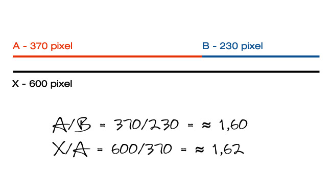
As you can see, the ratio that unites the different sections together is and will always be about1,62.
The gold section in nature
Therefore the gold section is a simple (so to speak) ratio of numbers and proportions that has its basis everywhere, from nature to art and it has always impressed the mind (and the sensations) of men.
In nature the gold section often has the shape of a spiral, possible to find wherever, from the flight path of some insects to galaxies.
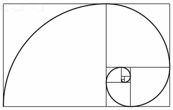
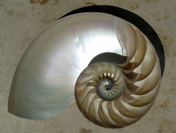
Gold section in nature - Spiral of a shell

Gold section in nature - spiral shape of a galaxy
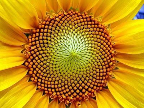
Gold section in nature - Sunflower seeds

Gold section in nature - Spiral shape cobweb
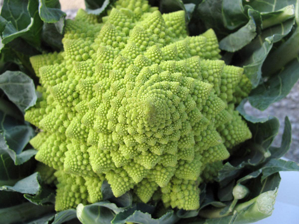
Gold section in nature - Cauliflower
But the gold section touches us directly: in the human anatomy in fact this section is found in theratio between the height of an individual and the distance from his navel and the ground.
Balance that is underlined in Leonardo da Vinci’s famous “Uomo vitruviano” .
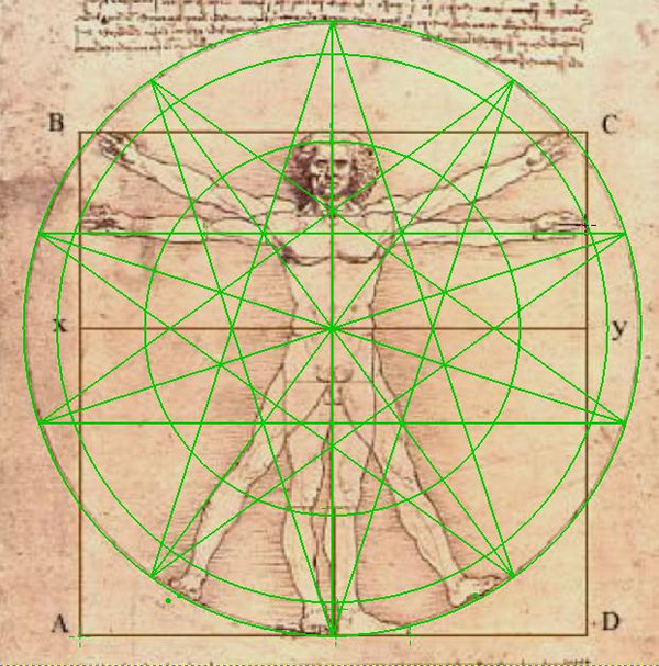
Gold section and Anatomy: The Vitruvian Man
The gold section in art
Several experiments have demonstrated that the human perception reveals a keen sensibility, free from any kind of rationality or logic, for the proportions of the gold section. This perception makes possible that artists can instinctively arrange the elements of any kind of artistic composition according to those proportions, in order to trace the canons of harmony and beauty that the gold section can bring out naturally.
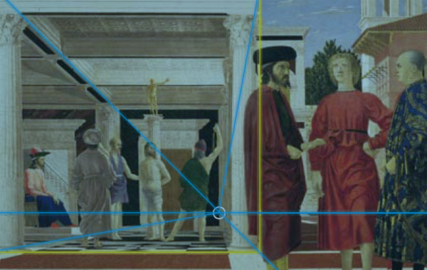
The flagellation of Piero della Francesca, painted in 1469. The side of the scene in the background (in the second level) has a gold ratio (1to 1,618) with the length of the entire painting.
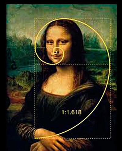
In Leonardo da Vinci's Mona Lisa the gold proportion is visible in the arrangement of the elements of the face, in the area that goes from the head to the chin and in the one that goes from the chin to the hands.
The gold section in photography
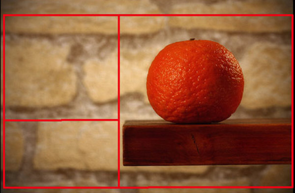
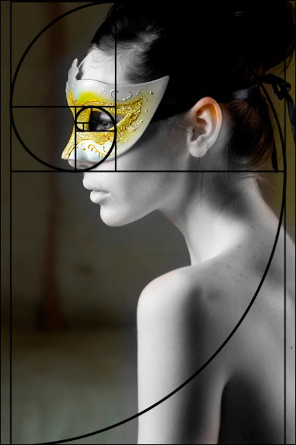
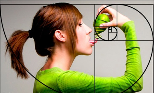
The spiral espansion typical of the gold section in photography is called “rule of thirds” and it’s the most effective -and easiest- system to follow in order to obtain eye catching images of great impact.

Gold section and web design
If the proportions and harmony of the gold section have such a potential that influences positively the subconscious of every individual, why not use these proportions in the web design?
After all the main purpose of a web site is to communicate and express, even through one’s designs, information. So, it could be a good idea to apply the gold proportions to the web design in order to obtain a more harmonious and pleasant layout and it’s quite easy to do.
How can I apply the gold section to the web design?
We assume that our website is made of two sections, the one containing the contents on the left (that usually has a larger size) and the side one containing a sidebar, like in the following image:
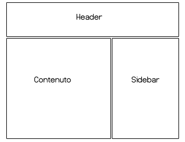
Rather than defining randomly the sizes of both sections, with a small calculation we can obtain the sizes proportionally to each other according to the principles of the gold section.
How?
Take the total size of our layout (960 pixel) and divide that value by our “magic number” (1,62):
960 / 1,62 = 592 pixel ( width of the section containing the contents)
960 – 592 = 368 pixel (width of the sidebar)
Want to do the shell test?
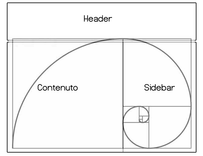
Simply perfect!
We can apply the gold proportions also to the other elements of our web pages, such as banners, advertisements and other small sections. Dividing in fact the width of a box for the value 1,62 we have the correct height in proportion:
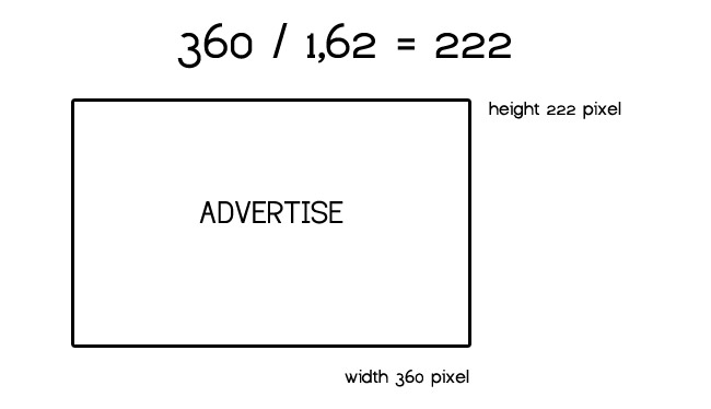
Following this simple formula every element of our pages could have a natural and balanced proportion respect to the whole composition; so we could create layout intrinsically more pleasant and harmonious for the eye and for the perception of users that will visit the sites once they’re online.
Conclusions
We saw how mathematics can influence the balance of a web composition and much more.
The gold section is without doubt one of the most fascinating and mysterious proportions that nature has given us and it allows us to create masterpieces of harmony and aesthetic.
Have you ever applied the rules of the divine proportions to one of your projects of web design? If so, have you noticed an aesthetic improvement of the project? I’m curious to know your impressions about this argument so controversial and curious!