Why typographically thinking ruins your site?
30/06/2011
Standard Font for the web
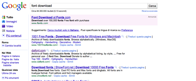
There are thousands of fonts, if you come from the traditional graphic world you know it well… otherwise it didn’t take you a lot to learn: there are many sites that offer a wide variety of fonts available for free download (watch out for licenses!).
Generally, who has experience with the publishing has a very refined eye for the font: a good graphic distinguishes the quality and the characteristics of a font, knows which one to choose, the most suitable one for the look & feel of a specific project and knows that he must not choose many fonts but just one (max two) would be enough. On the other hand, many beginners tend to over- exploit the font sites, always searching for the most extravagant ones, the easiest prey are the fonts of low quality and incomplete fonts ( most all of the free fonts).
But, whether the fonts are rightly or badly selected under the graphic aspect, the big problem is common to both categories and it is to choose fonts not suitable for the web: the hard truth, in fact is that the choice of usable fonts in the web is limited.
Just to be clear, the choice is not blocked, forbidden or inhibited in any way (and it’s for this reason that it’s so easy to make mistakes), simply there’re fonts that’s better stay away from: in the specific, we’re talking about fonts that aren’t widely spread.
To be more precise, you should strictly follow a limited list: the list of the web-safe fonts; but before we go deeper in this concept and advice you a solution, I would like to explain to you where the problem is.
Why choosing a non web-safe font is a problem?
Whether you’re a graphic gifted with an excellent taste and want to have your text in Bodoni or you don’t know nothing about typography and select your-strange-font, at 99% (just to be optimist) the user will see the contents with a font selected by the browser (with all probability “Times new roman”).
This is because with the specifics CSS2 ( the current standard) it’s true that you have the possibility to choose and declare whatever font (even if non existing you’ll not receive an error message), but the user will see it only if the font in question is installed also in his terminal.
This means that if you wanted to set an “Helvetica Neue Std Light”, you have to be prepared to face the fact that most all of the users won’t have that font installed and therefore you have to specify an alternative if you don’t want the user’s browser to do it for you: generally if the font is missing, the “Times New Roman” gets set up, but this behaviour can be modified by the user (advanced) in the browser settings (and can encounter differences according to the operating system).
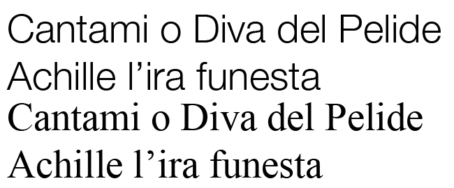
Putting the case in which the user didn’t modify the settings, however the graphic rendering of your site could definitely show the effects of it: a light and modern font, without grace, as the “Helvetica Neue Std Light” certainly gives a different impact respect to “Times New Roman”.
The standard solution
As anticipated, the solution is very simple: it’s essentially to choose the web-safe fonts, that are the widely distributed.
You’re probably wondering how can the spread of a font be determined: there’s no need to do a research to see which fonts are the most downloaded, just go and see which are the preinstalled fonts on the major operating systems: Windows, Macintosh and Linux.
[img grafico font os]
As you can see from the graphics, there are fonts more widespread respect to others, but generally the best choice would be to specify also another alternative font (or more than one) and at the end indicate the generic family.
I give you an example:
font-family: “Helvetica Neue Std Light”, Helvetica, Arial, sans-serif;
this statement affirms that the text will be visualized in one the fonts listed, following the order of declared choice. If I have “Helvetica Neue Std Light” installed, I’ll see the text with this font, otherwise the browser will look to the following one for the text rendering.
So I’ll see Helvetica if I’m on Mac or Linux (where Helvetica is a preinstalled font) or if I installed personally Helvetica on Windows. Otherwise, I’ll see Arial. At the end, if I shouldn’t have either Arial, I’ll see whatever font without grace (sans-serif).
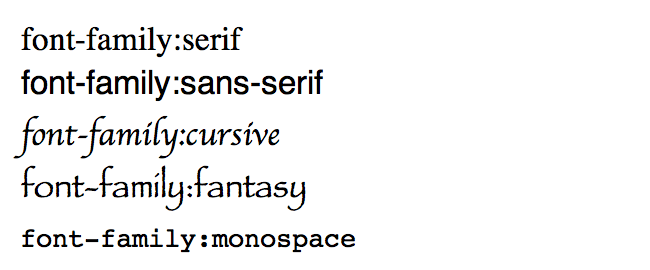
For completeness: the generic families are ‘serif (ex. Times), ‘san-serif (ex. Helvetica), ‘cursive’ (ex. Zapf-Chancery), ‘fantasy’ (ex. Western) and ‘monospace’ (ex. Courier).
Other solutions
If you absolutely can’t renounce to your font and the idea that someone will not see the siteexactly as you want troubles you, you could think that a good way could be is to incorporate the text formatted as you like inside images and also position it inside cozy tables… learn something about accessibility and then, after you’re reddened, continuo to read this article: this is not an acceptable solution!
Javascript and Flash
There are methods that use javascript or that import the text in a flash film, and that would be better to use only for the titles, obviously optimizing them to make them accessible to everyone ( non-sighted,poor-sighted, javascript disabled, lack of flash support…). Without going into details, you can search directly on Google the Cufòn and sIFR methods.
The future
Few years ago, some web designers had the idea to upload the font used in a zip file (or even not packed) on one’s space and link it from the pages of the site suggesting the download for an optimal visualization of the site: such technique didn’t take off both for the laziness and for the wariness of the users ( besides for a plausible ignorance).
In the future probably we’ll start uploading fonts from the web space of the site, not compressed anymore and with no need for the user to download them.
The specification @font-face of CSS3 ( initially introduced with CSS2, then removed with the revision to CSS2.1, it has been recently reintroduced in the drafts on the new recommendations for CSS3) in fact it allows to use the font we want and to make it visible to everyone, regardless if the user has the font installed or not on his terminal.
However, considering that the CSS3 language is still in the research and development stage, it is not yet fully supported by many browsers currently diffused (and it’s also right, considering that every CSS3 specific could be subject to change in the next few years).
If wanted, one can use the free services provided by Font Squirrel and Google Font Directory, which use @font-face: the first one gives the possibility to create or download some ready to use “kits” (containing font files, css, demo…) to upload directly on one’s space web and to integrate with one’s CSS, while the Google service houses directly the fonts available of which all you need to do is import the CSS.
Note: Just for the record, it’s important to know that @font-face is currently reported as an error of validation from the W3C, and in fact it invalidates the style sheet.
Usually which font do you choose for your sites? Have you ever thought about how these are seen on other terminals? Which technique do you use for your sites?


