Typography and minimalism: let’s design a simple and nice layout

17/01/12
One of the most common perplexities that I’ve heard saying regarding the typographic style is: yes, it’s fine, cute, creative… but it’s not a style suitable for a company site, corporate, no indeed.
It’s certainly a particular style, eclectic if you like, but it can easily be adapted also for a company site, obviously with some small adjustments and without “daring” with fonts too particular and scenic.
If we were to create a showcase site reproducing the features of this style, we should play with the typography to attract the attention on certain points in the layout, reduce at minimum- a bit like in the minimal style- the graphic elements and make the effect more appealing with the use of textual elements.
Bold titles, provocative colors, daring texts… a game of letters and spaces for a simple, minimal graphic and at the same time of impact.
Yes, but how?
Let’s immediately do an example and try it personally: Sweet house, a company that produces exclusive pieces of furniture, turns to us for the development of its site.
Many site of Interior Design have a deliberately essential style: very white and little graphics in order to highlight the images, the real point of interest. We also embrace this aesthetic choice, enriching visually the layout with some typographical artistry… I assure you that the final result will be worth it.
Ready?
Set the document
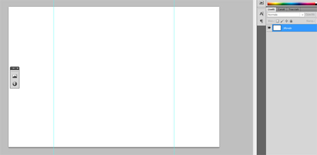
As always, we begin by creating the new document in Adobe Photoshop. We set a width of 1680px and a height of 1200px (it should be enough) and we insert the guidelines at 360px from the side margins. We’ll design our homepage within the section – wide 960px- bounded by these guides.
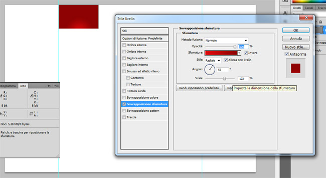
We create the background of our logo: with the rectangle tool we draw an area wide about 270pixel and we give it a radial gradient that goes from a dark red color (#8d0202) to a lighter red (#dc0909), so that a small glow is visible in the center of the rectangle.
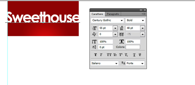
We write the logo/name of Sweet house, with the bold “Century Gothic” font (we stick on simplicity) and white color.

Now let’s try to make the logo more appealing, playing with the spacing between letters and the font size and making sure that the white of the logo merges at the edges with the white of the background.
We also add a small tagline:

We create a text menu, very simple (the style must however remain minimal and clean, don’t forget!):

Now we write a very strong textual slogan, capable of attracting the visitor’s attention.

Now we work a bit on this text. The typography must be very painstaking, both under the technical (margins, alignments, interlines) and the aesthetic profile (harmony, color, focus).
We reduce the letter spacing, to make the text more full-bodied and bold the key words that we want to highlight, increasing also their dimensions.

We add another short text line, smaller than the previous one considering that it will be put in second level respect to the object of the activity (Interior Design) and we work on the spacing of the letters until we obtain this effect:
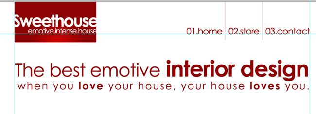
In practice, all the text blocks are aligned symmetrically, so that the eyes captures them “in block” and perceives them as a whole. Let’s see the visual effect:

Want to give a modern and perky touch? We use a fancy font ( the fantastic Honey should be perfect) and reduce the calibration of the slogan in this way:
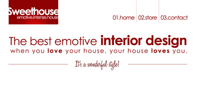
Pleasant and with impact!
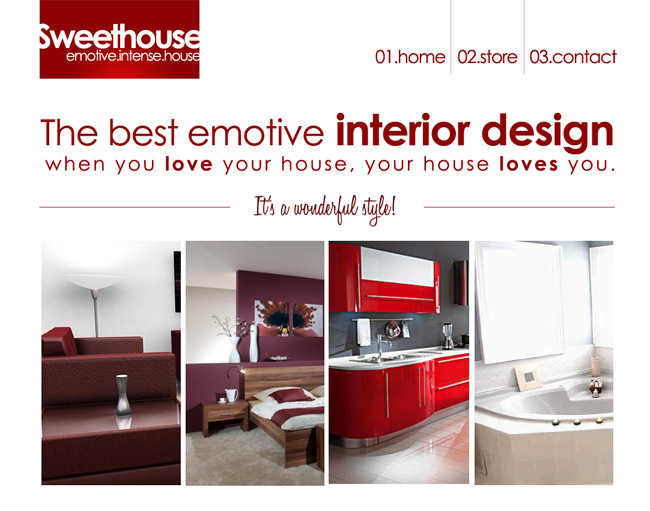
Now we insert a few images inherent to the activity. We could, for example, represent the four categories of products that Sweet House offers. To do it we’ll use four images properly processed. We select the photos and subdivided the layout in four columns.
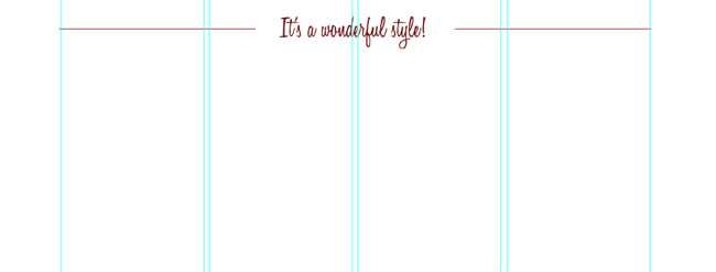
In each column we’ll go and add a vertical image that will visually represent the family of the selected product (kitchens, bathrooms, etc.). Look how elegant the final effect is:
We tag each photo with the name of the category, always using the same font, very readable and with an extremely soft and elegant bending:
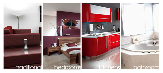
The text is less readable this way. We overcome this problem inserting a bordeaux color rectangular section to which we slightly lowered the opacity in order to still see the photo in the background.

Under this central section, we can insert two call-to-action, also manipulating here the typography in order to highlight more certain words (like “catalogue”, that obviously has the priority over the word “download” and highlighting the telephone number).

As you see the text has a visual component very strong: there’s no need for icons, images, texture, pattern or other graphic ornaments, since the layout is already highly communicative and the typography does perfectly the dual role of graphic and conceptual element.
We add a small copyright and our layout is complete. What do you think of it?
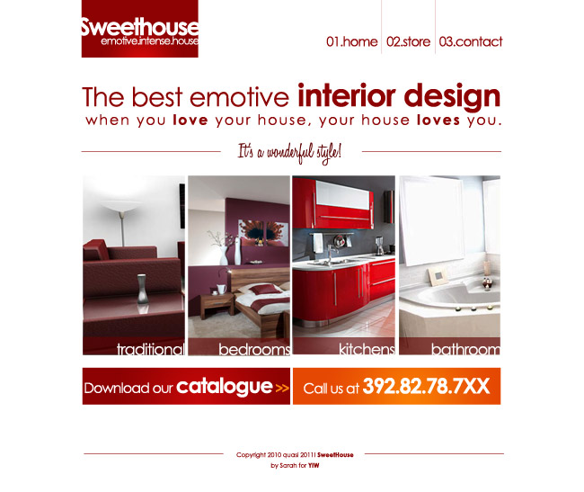
We reduced the graphics to minimum terms, however the layout is bright, richly detailed and pleasant. This thanks also to the typography and on how we worked with the fonts.
If you like it, feel free to download our psd file and to use it for your personal project!
Versione: 1.0
Pubblicato: 04 January 2011
Dimensione: 1.47 MB
Download: YIWTypography