Tutorial + Psd: creating a professional Vcard in a few steps
08/07/2011
Tutorial: creating a professional and captivating VCard
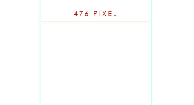
Let’s open our graphics program and create a new document of 1000 pixels. We will make a VCard of 476pixels, thus it’s not necessary to set a width of 1680 or 1920 pixels as we usually do when we design a normal layout.
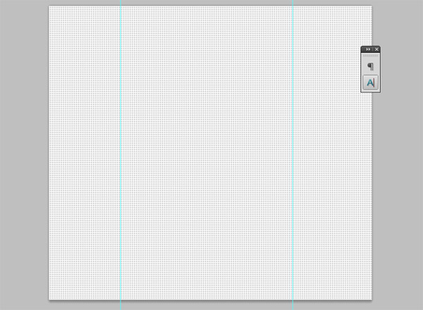
We set the guides at 212 pixels from the edges, so that our container of 476 pixels is included in the guidelines.
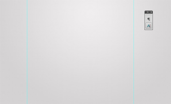
Let’s start by assigning a layer to the background. We want to create a simple and elegant VCard, thus we are oriented towards sober colors such as white or grey.
We thus set a gradient from grey (#d3d1d1) to a lighter grey (#f4f2f2) and choose the option‘radial layer’ in the layer styles window. We invert the layer so that the base is dark grey and the glow light grey and then manually move the layer up, so that we can position a part of the glow at the top of the document, as shown in the image below.

Now we set a thin watermark (you can download here) in the background. How? Open the textures and create a pattern (Modify >> Define pattern). In our document duplicate the background level, remove the layer applied and set ‘ pattern overlay’, choosing the pattern just created. We’ll have a similar result:
At this point let’s work on fusion methods and choose a method which allows us to see both the watermark and radial shade of the level below. In our case ‘suffused light’ is the ideal. We lower the opacity of the layer at 30% and we will have this result:
Now the watermark is very light, exactly the effect we wanted.
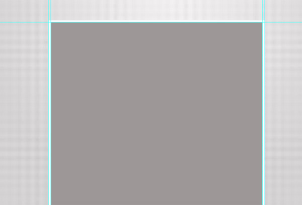
We start to create the container of our VCard: with the rectangle instrument we design a section of white color with a width of 476 pixels (guide to guide) and a height of about 615 pixels (at a later stage we can always increase or decrease such value).

Now we set the guide lines at 5 pixels from each edge of this section and design another rectangle inside it.
At this point we set to 0% the replenishment (attention, not the opacity):
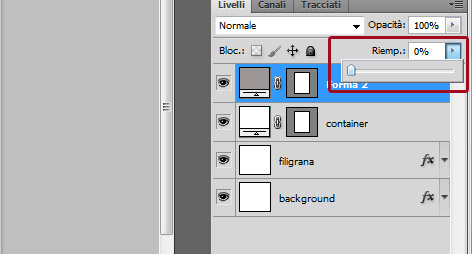
And, from the layer styles window, we set a trace of 1 pixel of grey color (#e7e6e6). The effect will be that of a soft finish around the container:

Now let’s give a touch of dynamism to this container, adding some shades to the lower section. Let’s take a brush, set the size at 40 pixels and hardness at 0%:
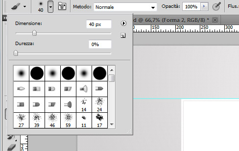
Now we set the black color and, holding the Caps Lock key to obtain a straight line, we trace a line that goes from the center of the container to the right side, as shown in the following image:

With the instrument Modify >> Transform >> Rotate we slightly rotate the line towards the right (with an angle of about 3 degrees it should be good):

Duplicate the layer and reflect it (Modify >> Transform >> Reflect horizontally), obtaining this effect:

At this point we move these layers under the container layer, so that we can obtain this effect:

Lower the opacity of the brushes and position them in order to create a realistic effect of this kind:

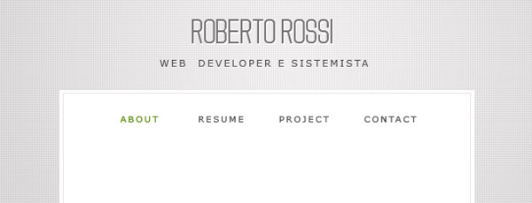
The moment has come to position our logo. Given that a VCard is more of a personal business card rather than a business website, we take it for granted that our client is not a company but an individual, a certain Roberto Rossi, who wants to introduce himself online.
We choose a pleasant font, in our case we will be using this font the one we have used also for the titles of YIW sidebar: cute, don’t you think?
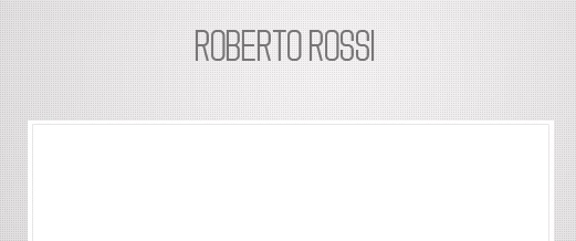
We set the text to a light white shade to give a major brightness to the name of our client:

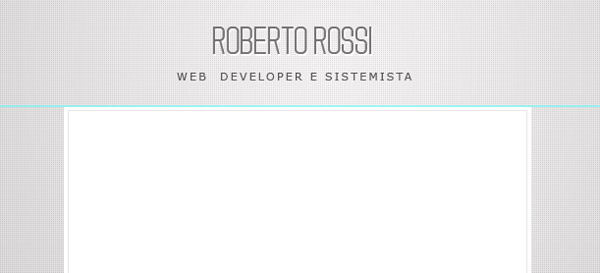
Add, as a personal tagline, the qualifications of Roberto Rossi. We use a standard font (Verdana) to which we have increased considerably the letter -spacing:
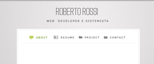
Now we start inserting the contents inside our VCard. We start by creating a simple but efficient navigation menu, assuming that our digital card is composed by 4 sections: Home page (we will name ‘About’), Resume (in which we will insert Roberto’s curriculum), Projects (in which Roberto can put his portfolio) and Contact, in which we will insert a contact module and the links to the various social networks.
We add small icons to make navigation more pleasant. To achieve that, we will use the icons of the Mono minimal icons set, simple and making an impact. Then we insert a thin line under the menu, in order to create a separation with the contents we will insert in the page.
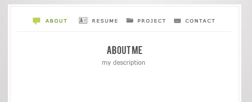
Insert a title and a small subtitle. For the title we use the beautiful font Bebas, bright and legible.
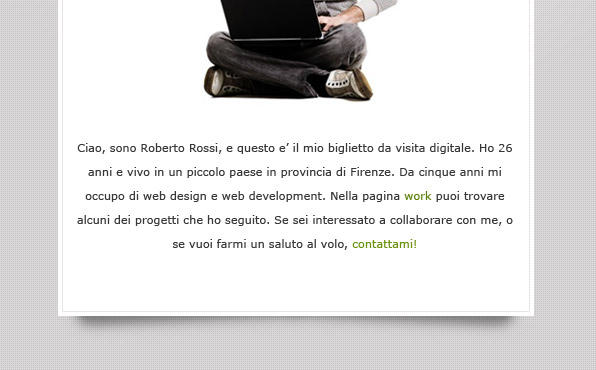
At this point we reached the most interesting part: how to insert a picture of yours in a Professional VCard. There are several methods to show oneself in your online business card, and they are all very useful.
Maybe you opt for a classic picture, a balanced thumbnail without many excesses in style, or maybe you prefer something more fanciful..in every circumstance my advice is: choose a quality picture, possibly taken from the front (helps instill a feeling of trust in the person that is visiting your website) and make sure your eyes are visible (no sunglasses, people!); try to have a smilingand simple expression, with no smirks or austere expressions other than spontaneous.
In a few words: an informal pose is pleasant to watch. (to learn more on this topic I recommend you to read this article!)
For our Roberto we choose a pleasant pose, lively and very nice. What do you think?

Under we put a small but incisive text description:
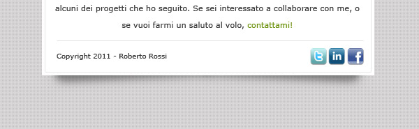
And, as a conclusion, a small footer containing the copyright and the icons of the social networks.
And our VCard is ready! Let’s take a look..
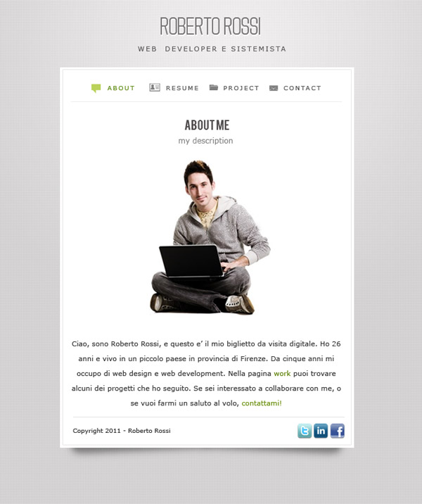
Simple and having an impact, don’t you think?
Obviously, seeing the other pages, perhaps put in code, with a gracious slider in Javascript which allows navigation is quite a different thing…
..maybe, if you got the patience… who knows!
Versione: 1.0
Pubblicato: 14 March 2011
Dimensione: 244.67 kB
Download: YIVCard