Webdesign: let your website communicate the right way
16/05/2011
If you’re just starting out as a web designer, you might still think -erroneously- that creating a site is simply putting good graphics into code, uploading everything to a host, and voilà. Done.Nothing more, nothing less.
The truth is, creating a website is a combination of numerous, complicated steps, each one linked to the next, and behind everything there’s a careful analysis of even more factors. What’s your target? The message to communicate? The competition? The client’s needs? What are the current aesthetic trends? The best colors to choose? They style to use? And so forth, until you have a clear idea of the work to be done.
The basic concept is: the website, once it’s online and at the mercy of your clients,communicates. And therefore it’s essential to keep working until the messages – more or less subconscious – perceived by your visitors are clear, positive, effective.
In a few words, what do you need to look out for?
Communicate the right message with the right colors
The choice of colors for a web project depends, above all else, on the company colors (if there are any) and secondly, on the target you’re addressing, as well as the message you intend to communicate.
There are many guides and articles that discuss this and they can help orient you towards one color instead of another. Choosing the right colors is truly important, as the human eye is very sensitive and we tend to psychologically associate a meaning with each color.
There’s something for everyone. Before you choose the colors for your web project, grab pen and paper and make an outline of the most important concepts related to the the business you want to represent online. It can help to play with some key words: the website you’re creating is for a day spa? The concepts to work with could be: relaxation, silence, peacefulness, massages, essential oils, aromatic herbs, water…with a mental picture like this, would you ever design a black site? Or a red one? I don’t think so. In this case, the right colors could be blue or green, in soft delicate tones. Using other colors could disorient the user and transmit an ambiguous or discordant message.
Communicate with an appropriate style
There’s no hard and fast rule for choosing the style to use, design is versatile: want an example? It’s plausible to think that grunge is not the most appropriate style for a church website, but there are churches that, to get closer to young people and to revamp their image in an original way, have chosen this style. And the results are very interesting!

Vice versa if the church’s objective were to keep a traditional image, instilling a sense of security as a classic institution and drawing the attention of an older population, they should have certainly chosen another style, something more sober.

The same thing goes for colorful, eccentric, peculiar layouts that makeup webdesigner and graphic artist profiles that, thanks to the style of their layouts, express their imagination and entice potential clients.
In design, everything depends: before choosing, a good target analysis is necessary.
Communicate with relevant and original images
A picture is worth a thousand words, everyone knows this. Communicating with photos and visual depictions expresses concepts and emotions in an instant. So, it’s very important to choose wisely the images to use in the website, especially if they’ll go in the header and therefore will be of great visual impact. When dealing with a technical or professional business, images must be relevant, representing as clearly as possible the verbally-expressed concepts or in some way depicting the client’s activity.
Avoid using graphic elements that have nothing to do with the project you’re working on, unless you consciously want to confuse the user.
The Red Rover company site is an interesting example.

We’re not here to analyze in detail the site’s graphics, but to look at the use of, more or less appropriate, specific graphic elements. A while back I put this site in the showcase of websites dedicated to animals and only after I looked at it again with a bit more attention, I understood that it’s actually a marketing and communication site. Unfortunately every detail on the webpage (the collar at the top, the dog on the header, the bone at the bottom) makes the user believe that the website deals with services pertinent to the animal kingdom. It’s a glaring example of irrelevant images and incorrect messages.
In the event of a creative business (for example, a publicity agency), you can allow yourself to choose conceptualized and abstract images, seeing as in certain fields it’s better to be original than to be clear, and the risk of being overly obvious with classic images of a mouse and colored pencils is too high to not take into consideration. The basic rule is: be daring, use your imagination, stand out from the crowd.
This is a rule that, alas, is often underestimated. Just take a look at the latest trend, the (ab)use of images of sofas and armchairs, in the websites of numerous graphic design and publicity agencies.
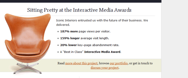


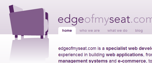
Even if the concepts expressed with the image of a sofa –comfort, relaxation, ease- are correct and the sites well-designed, unfortunately with the abuse of these graphic elements themessage gets lost and it’s no longer captivating or effective. Therefore: yes on concept communication using images, as long as they’re original.
Communicate with well-structured content and good typeset
You probably can’t stand hearing, once again, that a good typeset is essential to a website’s success: we’ve already talked about this, several times, so I’ll limit myself to dusting off a few key concepts, summarizing them in a few simple rules.
- Use titles to direct attention and visually summarize the page’s text content. Separate the page in small text blocks and use <h1>, <h2>, and so forth, to avoid verbose and homogeneous pages that at first glance are tiring and take away the desire to read;
- Use bold to underline the most important concepts and make them stand out from the remaining text;
- Use good spacing, to make the text more legible;
Communicate credibility
The reader wants transparency and clarity: make him understand immediately who’s behind the website (use real first and last names, nicknames aren’t exactly synonymous with professionalism) and give him the possibility to quickly and easily contact you.
My suggestions is to not limit yourself to a simple form, but to provide, if possible, some valid alternatives. A telephone number, especially a land line, is always a sign of stabilityand instills a certain sense of trust.
You’re a freelancer and you collaborate with some graphic design agencies? If you can, put that on your website, possibly on the home page: it will be immediately visible and the user will know that there are others out there that already use your services and are satisfied with them.
Lastly, whatever business is promoted on the website you’re designing, dedicate a small section to testimonials: there’s nothing more reassuring than positive feedback, especially if it’s left by someone that can be traced. It’s important to add credibility to your testimonials by associating them with existing and verifiable e-mail addresses, telephone numbers, or websites.
Conclusion
Colors, layout, images, content…in this article you’ve seen a few details to take into consideration so the website you’re working on can comunicate in a positive and efficient manner. While working on a project, be it graphics or web, it’s essential to know your target and the message to promote, and using this base you can chose the appropriate style and graphical elements to be used.