Which is the best font to use when developing a website?
10/05/2011
A good typography forms the basis of a well-defined web project. Font selection is particularly important and it has to be accurate and based on a detailed analysis so that the textual content blends well with the graphics of the page, thereby tempting a person to remain on the site. In this article we will look at the best fonts to use for web development and which ones to choose for our projects.
While working on the graphic layout of a website, I’ve realized that using a certain font over another can greatly influence the overall look of a website.
For instance, an excellent looking layout could lose its shine if the inserted text is not deemed a good match.
At first, I must say that it was not easy to understand that it was the font which was not working; apparently my beloved Georgia font was not blending well with the other graphic elements.
So, from that moment on, I’ve learned to pay particular attention to the font selection and I must admit that this has brought about a great improvement in the overall quality of my projects.
What criteria should I use when choosing a font?
Writing on the web is different from writing using pen and paper. And, there are studies which show how reading text on a screen is slower and more tiring compared to reading on paper. Our task as web developers is to create a web page that minimized these negative aspects related to reading online, as well as choosing the right set of fonts which blend seamlessly with the other elements of a web page.
When we are choosing a specific font, we will have to consider the following elements:
- Legibility: The most readable set of fonts you can find online are Arial, Courier, and Verdana. The least readable is Comic Sans, a font that is best to avoid and not use in any projects for it is a highly abused font. Furthermore, this is the only font that people havepetitioned against its existence, and this says it all.
- Dimensions: Verdana font size 10 is the most popular choice, which appears neat and gracious. For a font size 12, preference is given to the arial font. And what about for size 14? In this case, Georgia is the most popular font.
- Appeal: The best-looking fonts on the web seem to be Georgia (that has a projectdedicated to it) and Times New Roman. Personally, I find this choice to be highly subjective since the look of a certain font is based on its compatibility with the project involved. As a matter of fact, the Trebuchet font could be quite elegant and sophisticated in one website, whereas in another it could lose its appeal.
Which fonts should I use when developing a website?
It is best to use a standard set of fonts, so that web pages can be read without any problems by all the various users. If you want to use personalized fonts, you will have to wait until the @font-face feature found in stylesheets are supported by all web browsers.
The following table, created by Richard Rutter, shows which set of fonts are installed as default items on both Mac and Windows OS, which ones are installed with the various Office versions and which ones are installed with Adobe’s Creative Suite program.

Thanks to this table we know that the fonts most compatible with the three main platforms are:
- Georgia
- Palatino Linotype
- Times New Roman
- Arial
- Trebuchet MS
- Verdana
- Comic Sans MS
- Courier New
These are the most widely used fonts, except for the palatino linotype, which is a font that is less known. However, I’ve found this last font type to be more original than the Georgia font and also very easy to read.
You’ve been able to successfully grasp the main concept but are you in need of a little inspiration? Then let’s look at several websites, which have been able to ameliorate the overall look of their pages using the right font.
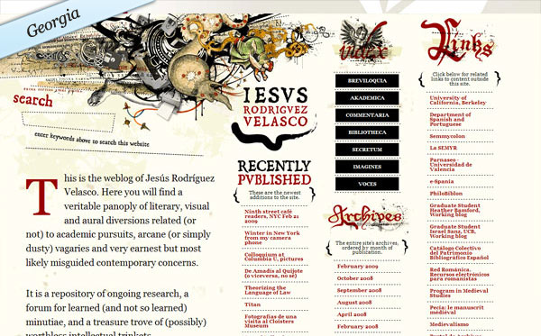

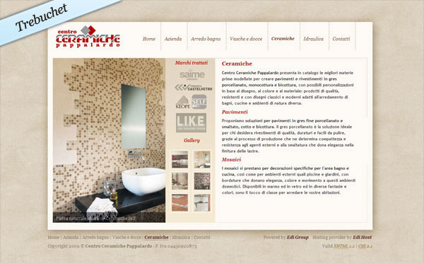


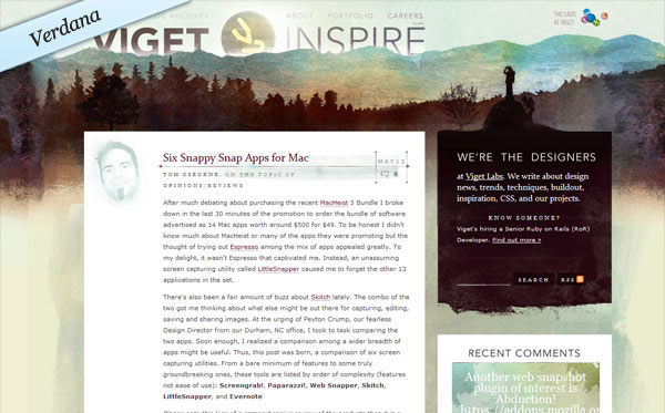

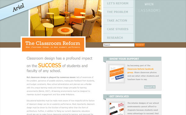
As you can see it is not just a matter of having a right or wrong font: in each of these websites, the font selection –whether it is georgia, arial, or trebuchet – is made on the basis of creating a equilibrium.
Word of advice:
- Trebuchet: Very elegant although it is a bit frivolous. It is best used in websites that are sophisticated and minimalist; sites that base their look on the typography. Personally, I prefer to use it for the textual content, and it is best to avoid using it for the titles as a large font size does not look well for this font type.
- Georgia: This one is my favorite. Perfect to use for any type of text, for titles, in italics or also as bold font. Be careful though, this font looks best with a line spacing of 22 px. A line spacing of less than 22 px makes reading difficult and it could distort the proportions of a webpage.
- Verdana: This one is a great choice since it is the most readable font on the web and this is due to its clear-cut and soft look which makes it ideal for any type of project. Personally, I prefer to use this font type on a small font size (such as 10/11 px) instead of using it for titles and other big-sized text content.
- Century Gothic: This one must be used with caution, since it is not the most readable font at size 12 and at size 20 it loses most of its quality. On the web, it must be said that it hasn’t been accepted entirely. However, in small doses it conveys a fresh style.
What if I want to use other fonts as well?
Every graphic designer knows how frustrating it is to work only with a standard set of fonts: this can be quite a limitation which can degrade the graphic work.
For a set of unique and cool-looking graphic effects (such as citations, slogans, titles, links) I suggest you use more exclusive fonts that can be integrated in css as images. This will make your web pages much more unique.
I suggest you take a look at this font collection: they are great-looking, perfect for professional designs, and they’re also free.
Conclusion
An accurate selection of fonts must be accompanied by other important considerations in regards to improving the typography of a given web project. These are the following:
- The contrast that exists between the background and the text color: the most readable setting is having black text on a white background or viceversa, while the worst setting is to have blue text on a fuchsia background;
- The titles;
- Dividing the text into brief paragraphs;
- The use of static texts (animated text can harm the overall reading experience).
- The correct use of spacing, including line spacing.