Why tables and divitis make your site inaccessible?
 17/07/2011
The best thing would be to eliminate the problems upstream, making accessibility and usability you’re form mentis: you should correct your approach towards the web before you commit a mistakes.
However, in all cases, whether the mess is done or the confusion is only in your mind, we’re going to see how to eliminate the most common problems that make your site less accessible and usable.
Table layout and the spacer.gif
Fortunately it’s an error always less common, but for years it has been a real plague.
The tables are used exclusively to represent logical relationships between data (text, numbers, images): if you want to use them for something else, don’t do it.
As you would never use a corkscrew to comb your hair, you shouldn’t even think about using a table to lay out a site: tables must be used only to present data.
Why people use the tables in the wrong way?
The layout in tables spread during the period of the specifics CSS1, particularly for the ease with which one could set a layout 100% wide, to occupy the entire width of the browser window, and also thanks to certain editing wysiwyg programmes (and also to the “section” tool of Photoshop) that in such modality, codes were created directly with a thoughtless use of nested tables.
Today, those who still use tables to page, generally do it for ignorance; but let’s see why it’s a problem.
Why is it bad the use of tables for pagination?
Using tables to page the graphic layout of a site is the same as producing an excessive dose of presentational mark-ups: a series of rows and cells (often filled with spacer images ”spacer.gif”) with inside other tables that simulate margins and spaces between the elements ( that should be the task of the CSS). All this brings to a really excessive weight of the page.
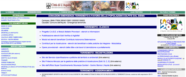
The website of the Commune of Aquila has an index page that weighs the beauty of 132.25KBof which 84.08KB made of codes (tables), with a graphic practically inexistent.

The index of the website of the Commune of Nettuno also weighs 428.69KB, but what strikes mostly is the use of divided images that ripeats itself for each item of the menu:
<td> <img height="23" src="/graphics/misc_div.gif" width="12" alt="nettuno"></p></td><p> |
After these examples you’re probably thinking that the problem is related to the websites of the municipalities, that are so “ugly” that the problem of the tables is just one among many. It’s not so.
 If we enter in the divs that form the structure of the official website of the BMW, we discover that it hides nothing but …tables!
For a total weight of 837.97KB. Of course the major part of the weight is given by the script and the swf films, but to reach 47.88KB of html codes for such a simple page…a really big mistake!
Besides an enormous weight, that has as direct consequence a very slow upload, we need to take in consideration how the tables and the graphic elements inserted this way are interpreted by the screen-reader.
For example , in the case of the commune of Nettuno, the screen –reader will read for each partition the alt-tag of the image: Home. Nettuno, Mayor and Coucil, Nettuno, etc. But if they didn’t put the alt-tag, the reading would have been even worse: Home, misc_div.gif, Mayor and Coucil, misc_div.gif, and so on.
Correlated Problems
A natural declination of the problem is found in the creation of a presentational HTML code, as the typical attributes of the cells are often used: bgcolor, width, height, background, align, valign, border, and so on or like in the case the Commune of Nettuno, the images are inserted directly in the html.

The site of the Commune of Cervara, always in tables, weighs totally 150,69 KB, of which 129.18KB of uncompressed images.
Moreover as I mentioned before, if you don’t use the right precautions, a site paged in tables is practically impossible to consult for non-sighted people, that use textual browsers and screen-readers to browse: the textual browsers (lynx type) line up the contents of the table starting from the lines and list each cell, from left to right.
As a conseeguence in a case like this:
| Title of site |
||
| menu item 1 | Title of page | |
| menu item 2 | Content B | content c |
| menu item 3 | Content C | content d |
| footer |
the result given by a textual browser will be the following:
Title of the site
Menu item 1
Title of the page
Menu item 2
Content A
Content C
Menu item 3
Content B
Content D
footer
Leading to a total lost of logical sense of the page.
You should also pay great attention to the spiders of the search engines, equally compared to non-sighted users: without the dutiful adjustments your site would be indexed like above; remember also that the weight of a page besides increasing the upload time of the same, is also penalizing towards other spiders.
Remedies
If your site has a graphic layout paged in tables, you’ll be better off if you redeem yourself, delete and redo the site.
You should fix in your mind a fundamental equation, that is HTML : semantic= CSS : presentation.
So eliminate that <table width=”100%> and substitute it with a simple <div id=”container”> to which you can assign a 100% dimension defining the rule: #container (width:100%), better if in an external stylesheet
Degeneration: divitis
What are you doing? I told you to replace the table with a div container and not to replicate each single cell, making it a separate div!
You have to be careful, this is one of the most common errors: thinking in tables, is what you absolutely must not do. When you think in tables, the fact the you use <div> instead of <td> doesn’t make you a better web professional.
I’ll bring you the example of one of the most famous sites in the world, that doesn’t need presentation: Facebook contains 1612 div!
Analyzing the div of Facebook it’s clear how this problem could be avoided , using time by time more suitable elements . The structure of a container (generally called link), for example, is more or less like this:
<div class=”UIImageBlock clearfix storyContent”> <img src=”profile's image”> <div class=”UIImageBlock_Content UIImageBlock_MED_Content”> <div class=”uiSelector mlm mlm hideSelector uiSelectorRight”> X (Hide) </div> <div class=”wrap”></div> <div class=”actorName actorDescription”>Name + tag</div> <div class=”mvm uiStreamAttachments clearfix”> <div class=”UIImageBlock clearfix”> Link's image <div class=”UIImageBlock_Content UIImageBlock_MED_Content fsm fwn fcg”> <div class=”uiAttachmentTitle”> Link's text (the one in blue color) </div> <div class=”mts uiAttachmentDesc”> Link's subtitle (the one in grey color)</div> <div> <div class=”uiTextSubtitle”>Link's author</div> Time of publishing · Like / Dislike · Comment · Share </div> </div> </div> </div> </div></div> |
I won’t go further in comments otherwise I’ll go mad, but all this could be done more easilywith less divs and classes, using other elements such as <blockquote>, <span>, <hn>, <p> and so on. Even the single links published could be enclosed in an unordered list (<ul>) and instead of:
<div class=”UIImageBlock clearfix storyContent”><p> |
could be used a <li> for each link-content. I would like you to notice that the <div class=”wrap”></div>, is equivalent to an empty cell.
Conclusion
What we saw in detail are the problems of a layout organized in tables and which is the best alternative to avoid this wrong practice.
Now, are you still a firm supporter of tables or I convinced you?
Or probably you hated the improper use of the <table> element but didn’t know that you were affected by divitis?
How’s the structure of your site? Do you often use certain div (mainContainer, content, nav…) or you aim to give a style also to the elements <html> and <body>? Which one is, for you, the best technique?