A creative touch to your layout: tips & tricks
20/06/2011
The answer to such a question can’t absolutely be found in a simple article, in fact we should talk about symmetries , white spaces, the page balance, typography , colors, coherence of communication, usability and many other arguments and factors. And maybe it won’t be enough.
However, even if the principles of graphics are practically endless (in certain fields, you never stop learning), there’s always something more that we can do to improve our graphic projects. To give that certain creative touch that makes the difference between a good project – but ordinary- and a special and more attractive project .
The following are just some tips: based on my personal experience, I hope can give you the right input to analyse your works with a different prospective.
Shades and borders to enhance the images
One of the most ugliest details that I happened to notice on amateur sites is about how the images are integrated in the layout. Let’s see a small example to understand better:
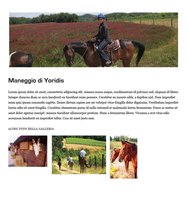
In the web page of this hypothetical riding track we find a big heading and, under the textual content, some images of the photo gallery. In both sections the photos could be enhanced with just a little adjustment: for what concerns the heading, the addition of a border and a shading we would obtain a more pleasant “photo” effect:
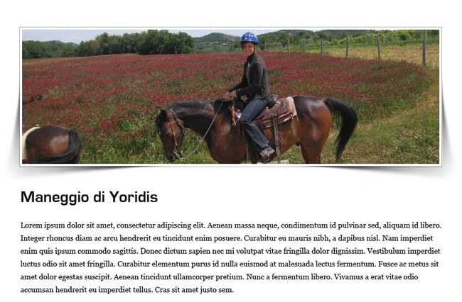
Thanks to this special shading, the photos have a realistic and original thickness, making the page less flat.
For what concerns the photos of the photo gallery, the first detail to adjust for a more cleaner and harmonious graphics regards the sizes of the photos, all different from each other. Aligning the images and assigning a default size to all the thumbnails we would obtain a more refined result, don’t you think?
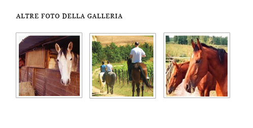
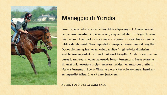
Also giving a different graphic cut to the pictures make your layout more pleasant: how? Slightly rotating the images and assigning a small shade, for example. Also in this page, with an intentionally simple style, giving a different setting to the pictures can really be an elegant graphic touch:
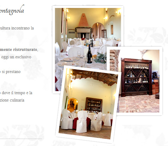
Even the “Polaroid” effect, often abused in the web design, gives an informal and young touch to the images.
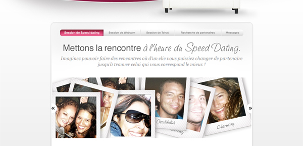
Reassuming : give a border or a light shadow to the images on the website, and in case of many photos placed side by side (like in a gallery) try to uniform the size of the photos. To give a more pleasant cut to the pictures, use a different graphic setting, slightly rotating and tilting them in order that they have a more realistic and spontaneous size.
The power of a nice photo
When I find myself before a website that shows – in the header or in the background – a beautiful photo 100% width, I always remain impressed. Images have a huge communicative potential, reason why we have to take advantage of it, especially if you have a lot of good quality photos available capable of enhancing the layout we’re working on.
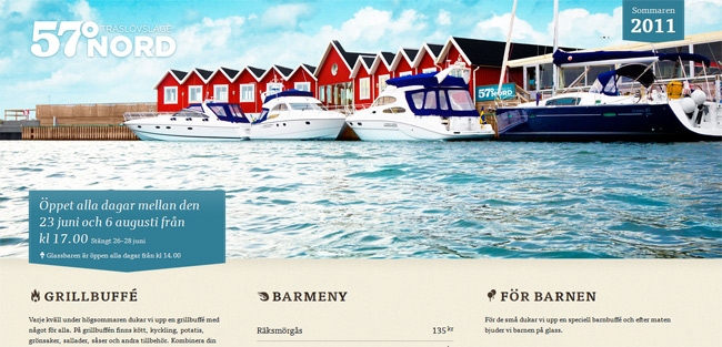
The site of 57Nord has quite an ordinary layout; the real beauty of the home page is given by the image placed in the header.
For what I’m concerned, when I have some beautiful photos underhand , capable of representing the sector/ product for which I have to create the layout, I always try to create a layout that can focus a lot on the aesthetic effectiveness of the images, rather that on graphic frills that leave the time they find. And since it’s really rare to find clients that provide decent and professional photos, mostly all the times I invest a small part of the budget to find myself some high quality photos, selecting which are the most suitable ones (for colors, cut or subject) to represent the client.
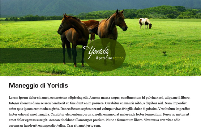
A wide image as the header gives an elegant and effective touch to the site of the ride track. The effect is definitely attractive.
Reassuming: a nice photo can be an excellent starting point for a really attractive layout. If you have the possibility to work with high quality photos (in some sectors, like in the food industry, it’s really easy to find some great images) base your layout on these, in order to enhance them, designing big headings or evaluate the possibility to put the photos in the background.
That realistic touch that everyone loves
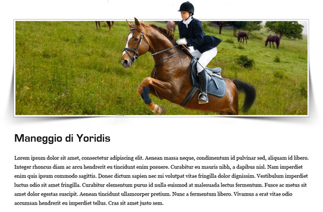
Always talking about images, here are other two advices to make your web projects more professional : use “borderless” images that blend with the background in a realistic way and play with an “out of border” detail, an effect that we can define “3d”.
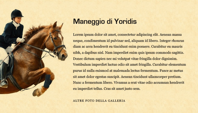
Here in the above example we can see the difference between the use of a traditional squared image and a photo with a borderless subject and inserted in our background. Using a borderless image we’ll have a more homogenous effect (let’s face it, the rectangular photo of this example is really ugly!) and pleasant.
In the next example instead , we tested the graphic effectiveness of an “out of border” effect: the image in the foreground seems to come out from the heading in a really particular and unusual way. Just a little pen work and our header has a creative and dynamic appearance.
Make the layout less anonymous
You’re planning a simple, minimal layout with a light graphic. Maybe you’re just customizing a template, considering the required timeframe and budget. You have almost finished the layout when you realized that something is missing. The graphics is bare, anonymous, very little customized. Substituting your client’s logo with one of any other business, the graphic impact of the layout won’t be affected at all.
All that you need to do is give a personal touch to the project, adding special graphics and details that visually recall the subject of the site. If you use a very linear theme (header, contents column, sidebar) that prevents you to personalize in an advanced way the layout, work with the background. Put a nice representative image or create a texture that can represent graphically your client’s business.

Instead if you don’t have constraints nor graphic limits imposed by a predefined structure, try to be original and integrate a special and unique detail in the layout. Let’s see a quick example:
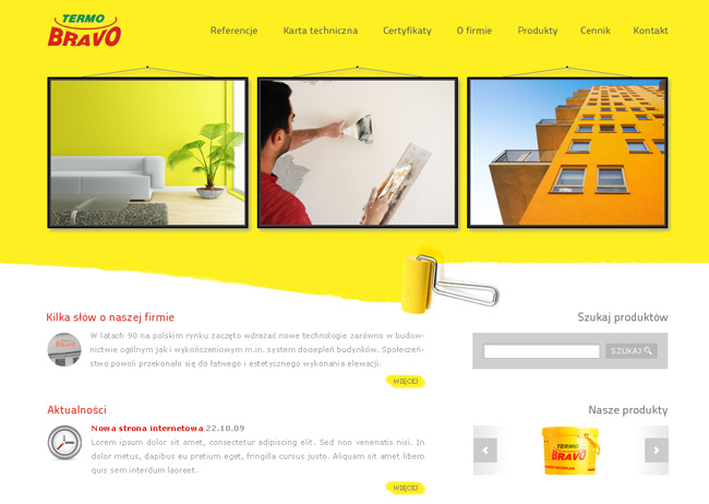
Termo Bravo deals with do it yourself works (DIY): the graphic layout is very simple and at the same time really original, as the yellow background is created by a paint roller. A concise, direct and particular way to express the identity of the company.
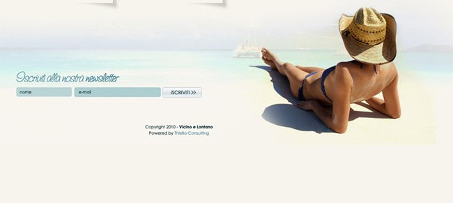
In the layout for a website of a travel agency specialized in Caribbean resorts, I inserted the in the footer the image of a woman sunbathing in bikini. This detail makes the page more original, following my client’s concept.
And in the case of our riding track, what could we use to give a personal touch to the page?
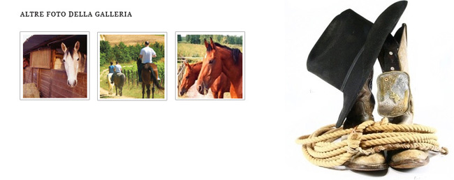
Spurs, rope, hat: evocative elements that can be easily associated to the idea of adventurous horse rides in the countryside.
A coherent graphic style
A problem common to many regards the inability to reproduce a graphic style coherent with the target, with the message that has to be communicated and with the identity of the company that we have to represent on the web. Designing a modern layout, with web 2.0 buttons and shades from black to white for a b&b furnished in nineteenth century style is not be a good idea, it seems obvious, but … there are people who still insist in doing so.
And not only: blossom wood texture on sites for engineering companies (?) and dark-grim style background for Caribbean dance schools (!) and so on. Businesses that aren’t represented properly from the graphic style adapted for the layout, so that when you visit the site it’s easy to be confused on the real object – and subject- of the same.
Every company, every activity has a graphic style with which it can be identified. And this style includes the right chromatic tonalities, the more proper fonts, more representatives images and much more. We have to try to think and put ourselves in the project we’re working on, avoiding to set a type of graphics that, even if we like it, it’s not very suitable for the specific case.
Let’s look at a small example.
Let’s say that the logo of our riding track looks like this:
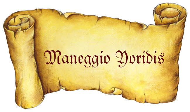
Old parchment, writings in medieval style: the graphic style adopted for the business identity is quite clear. At this point we can’t think to use a layout with a modern cut to represent the stables on the web. It’s better to bring also on the website this style, recalling it in the graphic details, colors and in the typography.
Get rid of fluorescent dyes, colored backgrounds, call- to- action and the shades web 2.0, leave the place for paper texture effect, sepia colored photos, handwriting fonts and brush vintage.
In practice, something like this:
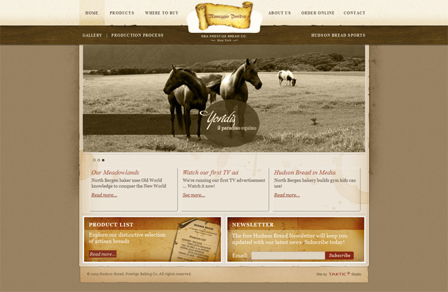
Reassuming: try to understand how you could represent the business identity of the client. Base your choice on the colors of the company, your client’s preferences, the audience target. A site shouldn’t serve only to be present on the web, but it should be able to communicate values and strengths of the company it represents.
Attention for the details, this stranger
Don’t know you, but one of the things that mostly intrigues me during the design process is the attention to the details, that particular attention towards many small details of a website, like a special hover effect in the navigation menu, or the layout of page 404, the graphic style of the contact form, and so on. Unfortunately in many projects which I work on, I’m not the person in charge of the development : it’s for this reason it’s always a small grief when, curious, I go to see the sites once they’re online and find my layout upside down and the details not respected, as if every space and every element doesn’t have a reason to be there and simply just fill up the scene!
Therefore, here some details that could make the difference in a graphic project (and that often get forgotten in the coding phase):
- Typography: an incorrect spacing, a font too big that it becomes spaced, little margin between titles and texts. The textual contents must be readable and at the same time nice to see. Also the choice of web safe fonts for the text must not be underestimated: Verdana is much more readable than Trebuchet, numbers with Georgia are ridiculous, Helvetica has a lower weight and it doesn’t have an excellent aesthetic result.
- Form: assigning a customized style to the forms is easy, just a couple of simple rules in the style sheets. So avoid to insert a default form, if this makes the contact page a real punch in an eye. Change the size of the forms, assign a color to the boxes, use a customized button. There’s nothing uglier than the default button to submit the form.
- Textual content: it’s important to present the textual content in a simple and clear way. Avoid long paragraphs, if the texts are too massive divide them in small chapters with titles and subtitles. Also dividing the text in columns makes the page more readable and less awkward. Intersperse the text with some images so that each page is visually less heavier.
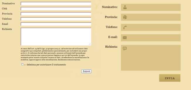
The different aesthetic impact between a default form and a form with a customized style.
Conclusions
With this article I wanted to share with you some graphic “tips & tricks” that I hope you can find useful during the design process of a web project. Let me know what you think about it and if you usually use one or more of the points I listed!