How to create a professional logo? tips and examples
 22/06/2011
create a professional logo is a complex work that owes its success to hundreds of factors not easily summarized in a post.
Today I will begin to expand that guide giving you some tips that I think may be useful. To help me do this with an example: our client is now the owner of a nursery called "Blue Flower" who has commissioned the creation of the logo of his activities.
1. Choose a good font
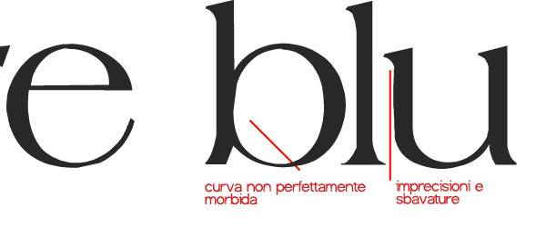
I often find appealing fonts from the aesthetic point of view but at the same time as very poor. In this case, or decide that the font it's worth, and you agree to redesign the letters that you need, or the baskets and choose something else. In any case, never use in your graphic design fonts curves vague, blurred or pixilated. Put the zoom to maximum, and analyzes the gleanings, the graces, the ends of each letter. Although minor, the flaws must be avoided.
An example of elegant fonts at first sight, but of very poor quality? Agate.

2. Play with the spacing of characters
It is said that a good logo must necessarily use fonts or payment sought to be considered modern and original: in some cases it takes very little to give to a font family looks new and appealing.
Moreover, the web is full of typographical layout that manage to integrate fonts like Times New Roman or Georgia in a creative way. How? Sometimes just play around 'with the spacing of the characters, or only change a few letters, to completely renovate the look of a good or Helvetica, in our case, the Franklin Gothic .

3. Learn how to edit and customize the fonts
It 'a speech now hackneyed that I will continue to do a good logo should not necessarily be accompanied by a graphic symbol to be considered professional od'impatto. Sometimes you just know how to play with letters, modifying them graphically, to make a logo name of functional and creative.

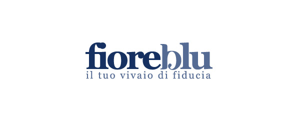
In this example I used a font full-bodied and easily editable, the Bauhaus 93 . I made sure that the letter "I" and "B" were together and I changed the g to bring up the soft curve of e. In this way the logo is still readable and acquires its unique while remaining simple and essential.

In this example, in addition to changing the character spacing in both name and slogan below, I modified the letter B to make the entire written more detail. The effect is simple but pleasant and efficient.
4. Stilizzatura not clipart
If you want to enrich the logo with a graphic symbol, my advice is: avoid the clipart, drawings, images of low quality. A good solution would be a stilizzatura graphics, which does not lose its effectiveness remains limited printing and print in color.
5. ... Or a monogram
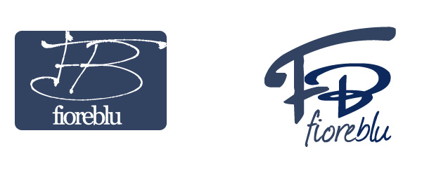
The monogram is a graphic symbol which is obtained by overlapping or combining two or more letters, such as the initials and last name or, in the case of an asset, the initials of the brand. So to speak, the monogram of our customers would be composed of the letters "F" and "B", combined with each other in order to replace any graphic icons or graphics.
In fact, if in the previous example, we decided to enrich the word "flower blue "with a flower bud, we could also decide to opt for a more abstract graphic embellishment, perhaps recalling the initials of our client.

Normally used for a monogram is a calligraphic font , which traces the effect of "signature".In this case I suggest you always call the company name in full, in a very readable font, so thatcustomers can plug in an instinctive way to the symbol name.
Conclusions
In this article I shared with you a few tricks and methods to create a good logo. Of course behind all this there is a much larger study, ranging from the choice of colors suitable for concept, from the target to which the company is geared to customer needs, which are different every time.
