Design inspiration: find it with a walk
04/05/2011
It is a concept that an employer cannot easily understand, but that’s how it is.
It is useless to lock up a designer in a narrow room and impose on him to crank out masterpieces of creativity: inspiration, same as with fantasy, it is not commanded. It simply comes and fleeting as it comes, it goes. If you are dealing with a new graphic project and if you are looking for an idea that simply won’t come, do not waste hours rummaging the css galleries in search of layouts to emulate: it is a method which, in most cases will take you to producing an ugly copy of somebody’s else work.And which will make you even more frustrated.
Just as a start, be aware that the real design is not on the web, on the screen, but outside. It is everywhere, to be more precise.
So, if you have the fateful freedom of freelancing, a comprehensive boss or if simply you can afford a break, take advantage out of it.
Go out and take a regenerative walk in your city. First of all because unplugging your mind for a while, cannot do anything but do you good, second, because the street can turn into an inexhaustible source of inspiration. And it’s only up to you, your creativity, and your intuition, collect as much material as possible.
You don’t believe us? Then I challenge you: let us see what can take life from a walk in Catania, supplied with a camera and the desire to do things.
Poster Designing
If you are also irreparably attracted from billboards, at the point of studying with an almost maniacal attention colors, images and fonts, you should be already aware that publicity can be an incredible source of ideas.
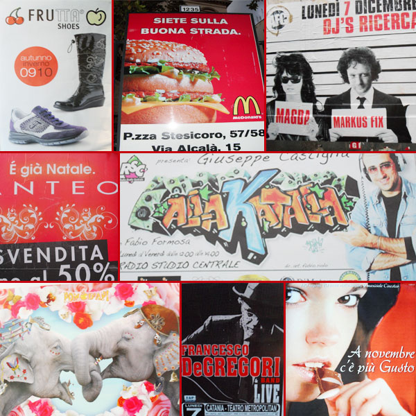
The poster designing analysis is a real and proper mental and creative exercise which leads a designer to ask certain questions: why this billboard attracts me, while this other one doesn’t communicate nothing at all to me instead? What makes it so fascinating? And the images being used in this other commercial are they suitable? Is the color matching correct?
Learn to mark every your sensation regarding this: write in a blocknote everything that impresses you, or on the contrary, everything you find of a bad taste. And if you can take with you a camera: colors and certain graphic effects cannot be explained with words.
Logotypes
We give up, it’s impossible to deny it: we are surrounded by logos. Everywhere we set our eyes upon, from the car’s hood to a display window, from biscuit packs to chewing gums, company logos, more or less famous, accompany us throughout the day. If the project that nags you is therefore the making of a logo, there’s nothing better then a closer look at the hundreds of logotypes that parade everyday before our eyes, almost unobserved.
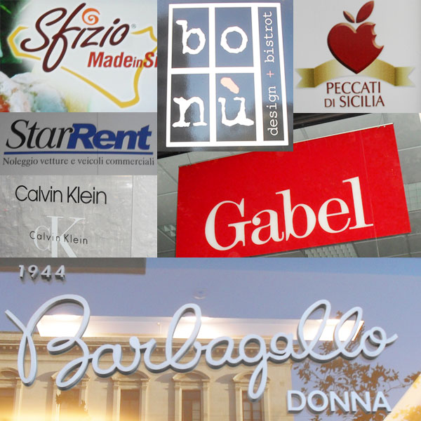
First of all a minute selection between professional and well done logotypes and te amauter ones needs to be made obviously from which it is impossible to get inspiration from.
It is obvious that the attention need not concentrate on amateur works, completed with the first available font from the most economical typography of the country, but on the brands that already at first sight reveal a communicative coherence and aesthetic efficiency. On the other hand, it is relatively easy to recognize a logo that has behind a studio and graphical skills enough that you go a little eye for that.
Also here, the questions to be asked are intended to understand the eventual strengths of the logo we have in front of us: which font has been used? How many and which colors have been chosen? Is the logo accompanied by a graphic symbol? Is it easily recognizable, even from a distance, with reduced size and on a grey scale?
Be careful not to get influenced by the very same urban legend that requires that the brands of weblarge companies are anytime and anyhow the top of good taste or professionalism: not only it’s possible to discover little creative masterpieces even in the logo of the boutique under your house, but often the logos of big companies are not that great after all and owe their popularity only thanks to the success of the product they represent.
Thus, do not focus only on logotypes of Gucci and Armani, that after all you already know well: study the less known brands instead, get inspiration from them if you believe they are actually well done, and on the other hand, if you recognize a weakness, memorize it in order to be sure you won’t commit similar errors.
Fonts
We all know that a good font can make or break the fortune of a graphic project and that an optimal font can alone become a mark of success. Therefore, keep an eye on the typography of every leaflet, depliant and billboard that you observe.
Take notice of all typographic combinations that you like and of fonts that once stamped they no longer have an optimal aesthetic outcome. Observe the colors of the writings: the words have all the same tonality or some are of another color for being highlighted? The size is linear for all the text content or are there some bigger written concepts or others smaller? How is the text positioned with regard to the images? What is on the foreground and what attracts less the attention instead?
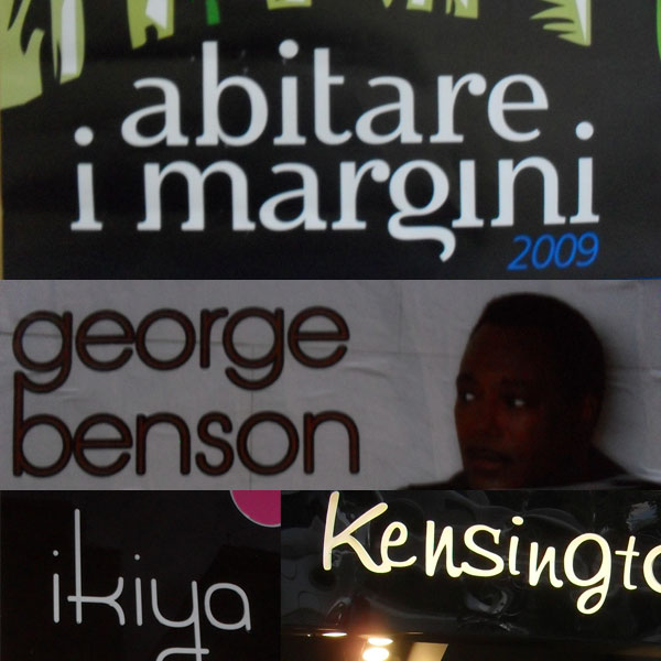
Again: there’s a font that by impact makes you go crazy and you have no idea which one is? Click. A picture and you will always have that font with you. You can search it in the appropriate websites or redesign a similar one. What counts is not let escape any potential resource that for a motive or another has impressed you. Because if it had an impact, it works. And if it works it is something that you can and have to use.
Depliants & brochures
Having one or more depliants to consult it can be very useful, above all if the project you are working on concerns paper graphics. Thus, here’s my advice, maybe a bit Spartan: enter stores and start the plunder, prey on, take all the illustrative material you can.

Even consider taking a trip to the fairs or exhibitions ( I have no clue about the rest of Italy but in Sicily every week they make a different display) it can be very useful: in primis because it allows you to make acquintances with a considerable number of potential clients, anyway( if they are participating in an exhibition it means that they are fond of their image and are preoccupied with publicity: who knows, they might be interested in a website or some other graphic service?), second because it’s possible to easily get stockpiles of brochures, catalogues and anything else.
The same concept obviously applies to business cards: before making one, try to gather as much material as possible in order to compare typography-spaces white-margins-interline and all those hundreds of small things that will help you make a professional and correct job.
It’s design everywhere.
You are starting to understand that design is everywhere, all around you. The time is ripe to refine intuition and attention and pay attention to those little details that can help you find the right inspiration. An example? A bottle in a wine-tasting shop it’s not only a container for an alcoholic beverage: it is a form, a label, the name of the wine, a color.
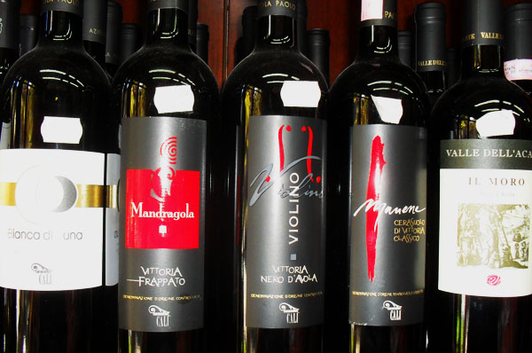
The bottles I have taken pictures of, what kind of message transmit to the client? The chosen colors, black grey and golden are elegant and sophisticated tonalities. The highlights in red render the aesthetic togetherness more captivating.
The labels have a particular relief effect and even the typography and the name of the wine communicate refinement and accuracy of the details.
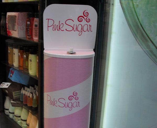
In the same manner this perfume distributor has an appropriate graphic to the target which the product is meant for: pale colors, youthful logo, somewhat round, prevalence of the pink color. And undoubtely, an aesthetic rigorously feminine and of a vaguely romantic appearance that, already at first glance knows how to provoke the curiosity of the young people.
Material
The largest part of designers for their own graphic projects uses free patterns and textures detected on the web without thinking that often it takes so little to create a personalized texture or brush. An example? You are undoubtedly aware that web design swarms in wood or frabric tables, of rubbed paper or woollen shirts.


It is affirmed that this style used with aesthetical taste can turn a website into a masterpiece of originality. And if it’s true that at times it’s enough to find the right type of fabric or a scarf of a certain color to graphically enrich our website, maybe isn’t a good idea to rummage in the wardrobe and start creating some textures ad hoc? We cannot expect somebody else to do it for us.
Let’s consider then what material we can recover in our domestic environment. A minimum of fantasy is enough to grasp at first glance what can be useful in a way or another.


They are all easy to adapt resources and which we can integrate with our works for rendering them more creative.
Conclusions
Given that the work of a designer is not manual but something conceptual, in order to find inspiration a refinement of intuition is required and above all setting your mind free to observe, study, discover. Try to see reality with the critical eye of the artist and feel free to manipulate, adapt and make yours everything that gives you an emotion. As you had the possibility to notice you can turn a simple walk downtown into an incredible source of inspiration and a big stimulus for your creativity.