How to present the draft to the client: tips and examples
29/04/2011
Here, we go, we finally got it: inspiration finally paid off and the graphic draft of the site we’re working on is finally finished. A last revision at the details et voilà , it’s ready to be presented to the client on a silver platter. Yes, but how?
What is the best way to present the draft to the client, in order that he understands –and appreciates – all the potentialities? How can we make our design attractive and make it as similar as possible to which will be the final version on the browser? Let’s find it out together.
Keep an eye on the details
During the final phase of a draft, it’s easy that some details get a bit left out . Before submitting the project to the client we have to be sure that everything is correct and at the same time refine some details that can give the final touch to our design.
Active state and hover links in the navigation
Navigation is one of the main elements of the layout and exactly for this it needs a look & feel able to catch the user’s attention (and your client’s also) in an immediate way.
Make sure that in the draft it’s clear both the active and the hover state of the links, so that the navigation results, from the static design, usable and pleasant under the visual profile.
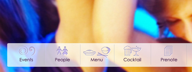
Figure 1 – Menu with hover and active status
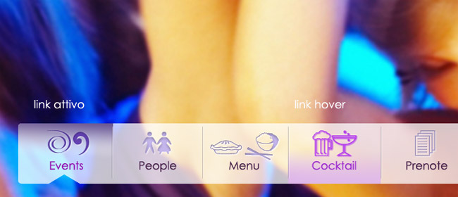
Figure 2 – Menu links with active and hover status
Text formatting, even if fictitous
Some time ago a curious article by Design Informer caught our attention with an intentional provocative title: the Lorem ipsum kills the design? The answer, needless to say, is yes: there’s nothing more awkward than a layout presented with a fake text paging:
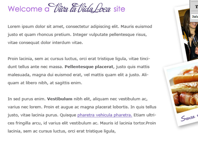
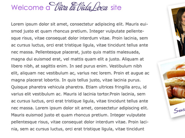 There’s a solution: while waiting for the real content to populate the page all that it remains to do is to properly format our lorem ipsum, in order to make it more pleasant and more readable.
We divide the text in well spaced paragraphs with a correct interline, a couple of bolds, emulate the color of the links in the text, add a bulleted list: we try to make the text as realistic as possible so that the page seems harmonious and balanced.
Let’s color with sample images
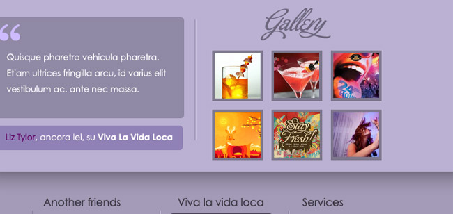
Images are another focal point of a layout, reason for which it’s good to avoid, in case we haven’t yet the definitive photos to put in the site, to present a draft full of sterile squares and gray rectangles. The effect is in fact really anti aesthetic, right?
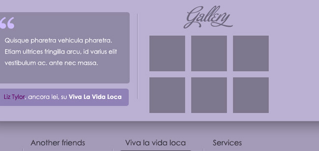
We leave the rectangles to our mock-ups and we put a few of fake images, full of colors that light up the layout.
Put the draft online
Someone says that there’s only one way to avoid recriminations and to give a correct overview of what our site will be once online: skip the step of the draft in a graphic programme and structure the layout directly in html, allowing this way the vision on the browser to the client.
Personally I think that this method isn’t one of the most correct ones and I already had occasion to say my opinion on the argument. However there’s a detail I agree with: put the draft online and make the client see it directly from the browser.
That means: save the draft as an image, put it on a html page and give to the background the image of the layout. Nothing particularly complicated.
Why this?
First of all, the visual impact of the layout on one’s browser is certainly different from the impact the client would have viewing a draft in Jpg or, worse, looking at a draft printed on paper.
Everything that concerns colors, dimensions, distances would be this way easier to check for your client, that viewing it personally from his computer could better see details that otherwise would be hard to detect.
Secondly in this way it’s possible to test directly on the browser all the characteristics of the layout with different resolutions of the monitors: if you present a draft with a background at 1920 pixel, it’s advisable to explain to the client that from his monitor with resolution 1280 x 1024 he can’t visualize the entire image, and so on.
I’ve known clients that were deeply irritated for the fact that they were able to see on their computer only a small part of the background shown in the draft in jpg: better make immediately clear these graphic details in order to avoid possible controversies once the site is published online.
Show the Javascript effects in action
If your draft includes the integration, in a second phase, of certain Javascript effects, don’t just put the image of the slider and the two indicators in the design and settle the question with a phrase like “here we’ll put an animated slider with the photos that slide”, but let him touch personally the characteristics and the potentialities of the animation that will be used.
Give him more alternatives, suggesting a fade effect rather than an horizontal scrolling and make him see the differences between the different effects available.
Every single javascript available online provides a very useful and complete demo page: use it.
This way the client will feel personally involved in the structuring process of the site and will better understand the real potentialities his site will have once online.
The draft is ready…how can I present it to my client?
The right way to express oneself and to approach the client at the moment of the presentation of the draft has been fully treated in this article, from which I’m reporting a small summary:
- Whenever possible, it’s advisable to present the draft in a direct way, in order to explain the details to the client;
- Remember that you’re not paid to do what you want and that, especially at the beginning, it’s essential to establish a trustworthy relationship with your client. Your task is to understand his needs and translate them properly in a finished product;
- Present a graphic draft to the client not accompanied by a complete technical description of its characteristics, is one the most common errors of inexperienced web designers;
- Once exposed the technical characteristics of your work, try to draw the client’s attention on the strengths of your project and how your choices are a real benefit for what will be the final product;
- Even if sometimes it may not be easy, when you receive an objection, your attitude must always be of total respect. You must never impose your opinion and above all must never consider the objection as a personal affront: the client is only doubting some points of your project, not your person or your work.
But what is the best way to present a draft?
If presenting the draft on the browser doesn’t convince you , you can opt for a more traditional method and still professional.
A good, effective and original idea? Create a detailed presentation of the draft, combining in a creative way images and information.
Begin with creating a small mock-up, that you can personalize later for your projects. Insert high quality images and of small dimensions 900/1000pixel, so that your client can see the details of the design.
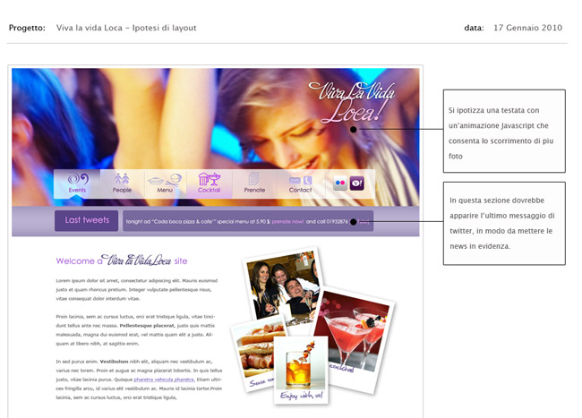
Especially if you’re not planning to present the draft in a direct way, but simply send it via e-mail and discuss the details with your client on the phone, it’s fundamental to create an attractive and informative presentation.
Give an overview of your project, inserting more images, explaining in detail the reasons behind certain choices (colors, typography, graphic elements), make the presentation unique and original, with great attentiont to the details.
In our case we created a three page presentation: a graphic cover, a second page containing the screenshot of the project and some textual information and a third page where we inserted some detailed information about the heading, the twitter section, the information in the footer, etc.
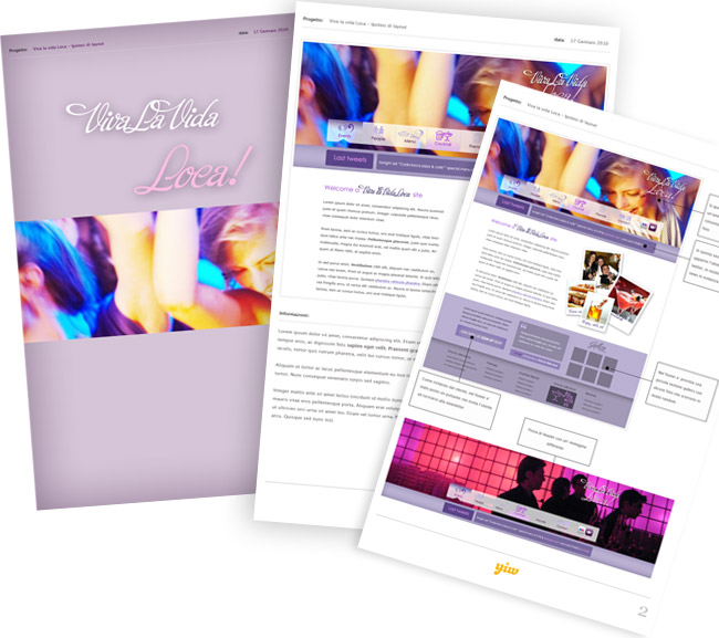
Informative and nice to see! What do you think?
And you? When you create a draft, with which method do you present it to your client? Do you also create a graphic presentation of the project?